Book Review and Notes from Color & Light, Artists’ Master Series
Finishing this heavy book about color and light was such an accomplishment, I decided to write this blog to highlight useful things I learned for fear I'd forget them otherwise. The book was packed with technical information, making it a difficult read but also rich with insightful advice.
The hard science - like the geometry of mirror reflections - was so mind-boggling sometimes, I doubt I'll remember all the details. Nevertheless, I did value how the book pointed out and corrected common misconceptions with scientific explanations rather than giving rules without any scientific backing.
Out of everything, I hope to remember the following tips, though there's plenty more in the book you could find fascinating in addition to these things.
14 Tips from Color & Light by Charlie Pickard
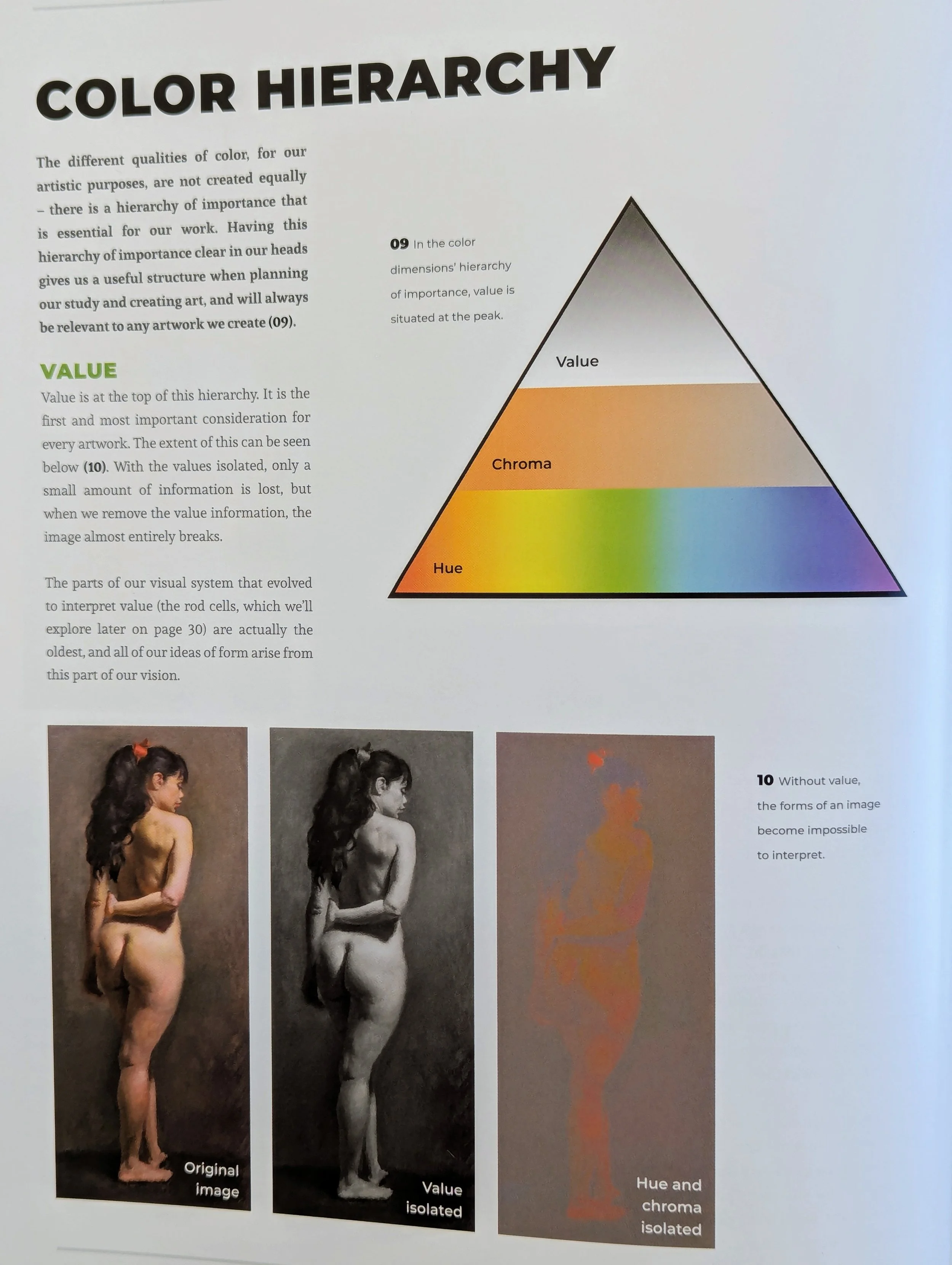
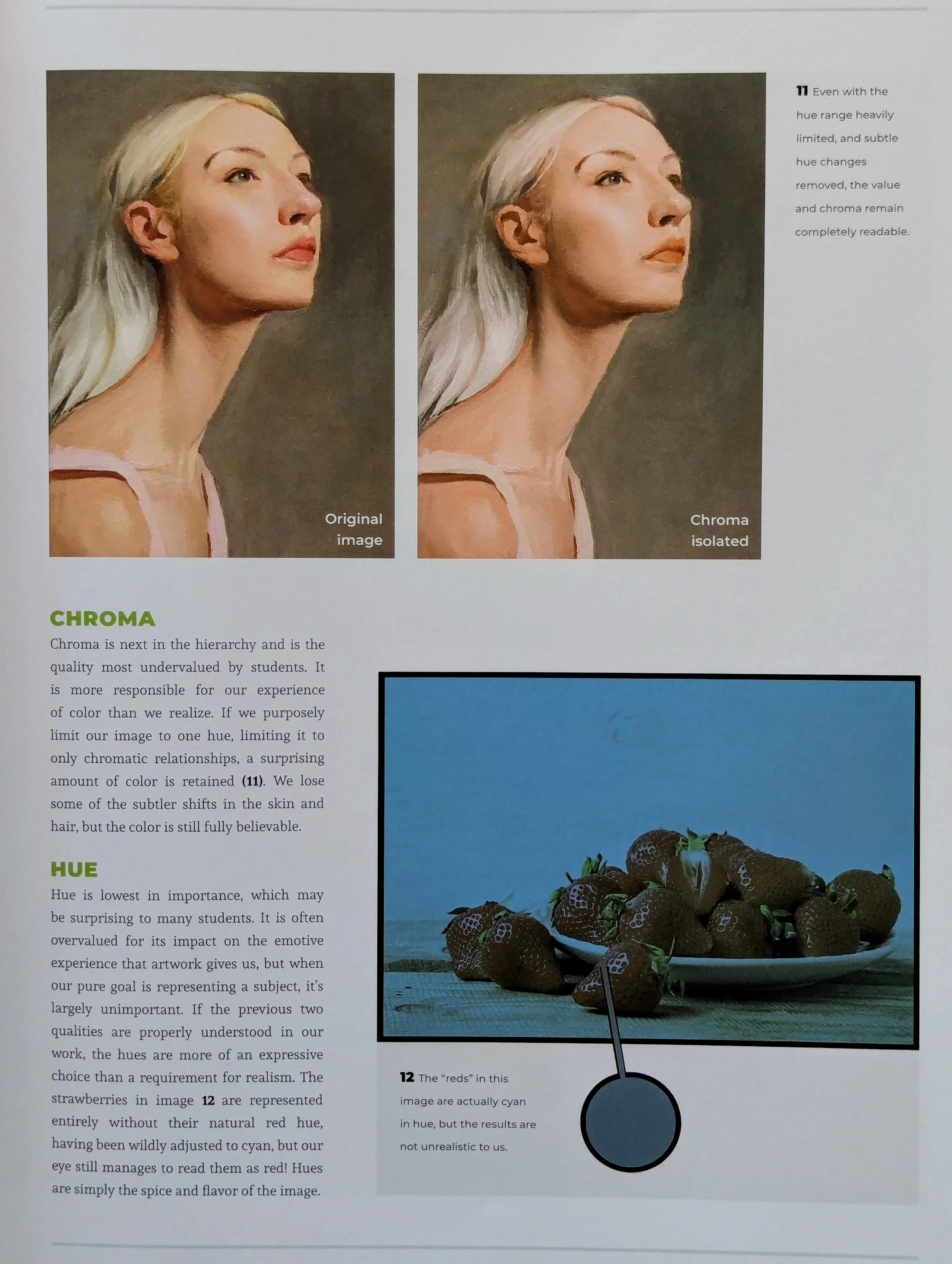
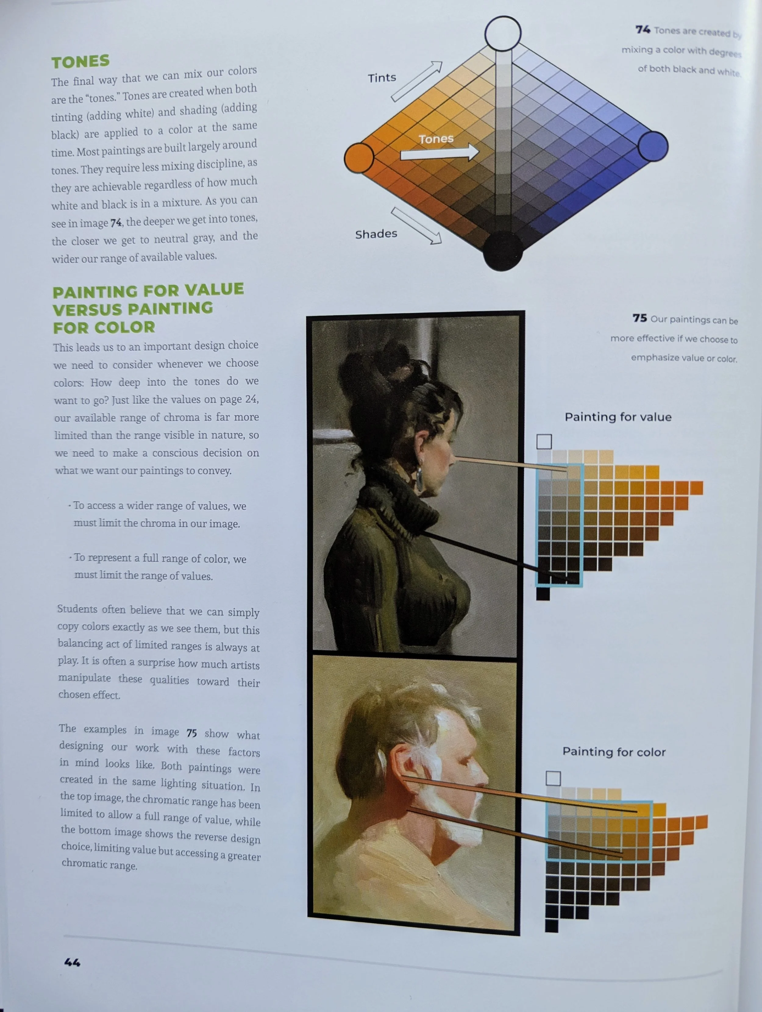
1. Value (light/dark) is the most important factor in art.
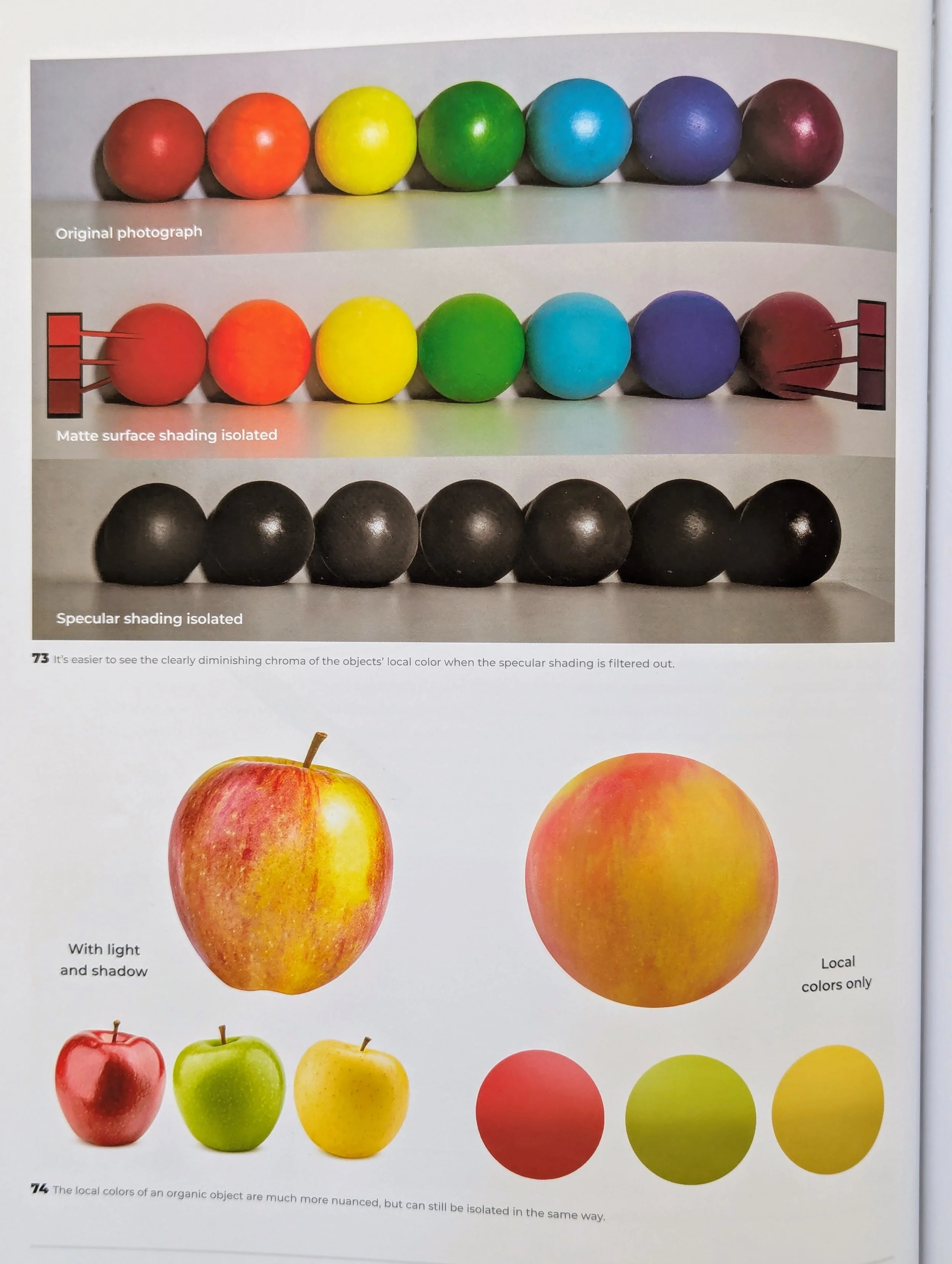
Before reading this book, I thought of art in terms of color (called hue in this book for specificity). Even monochrome pictures were framed as colors, black and white. However, hue is actually the least important element in pictures. Lightness and darkness, or the "value” of tones, is the decisive factor.
After value, the saturation of a tone (its “chroma") determines the quality of an image. You can play with all sorts of hues without impacting the believability of an image, as long as the chroma and value choices are solid.
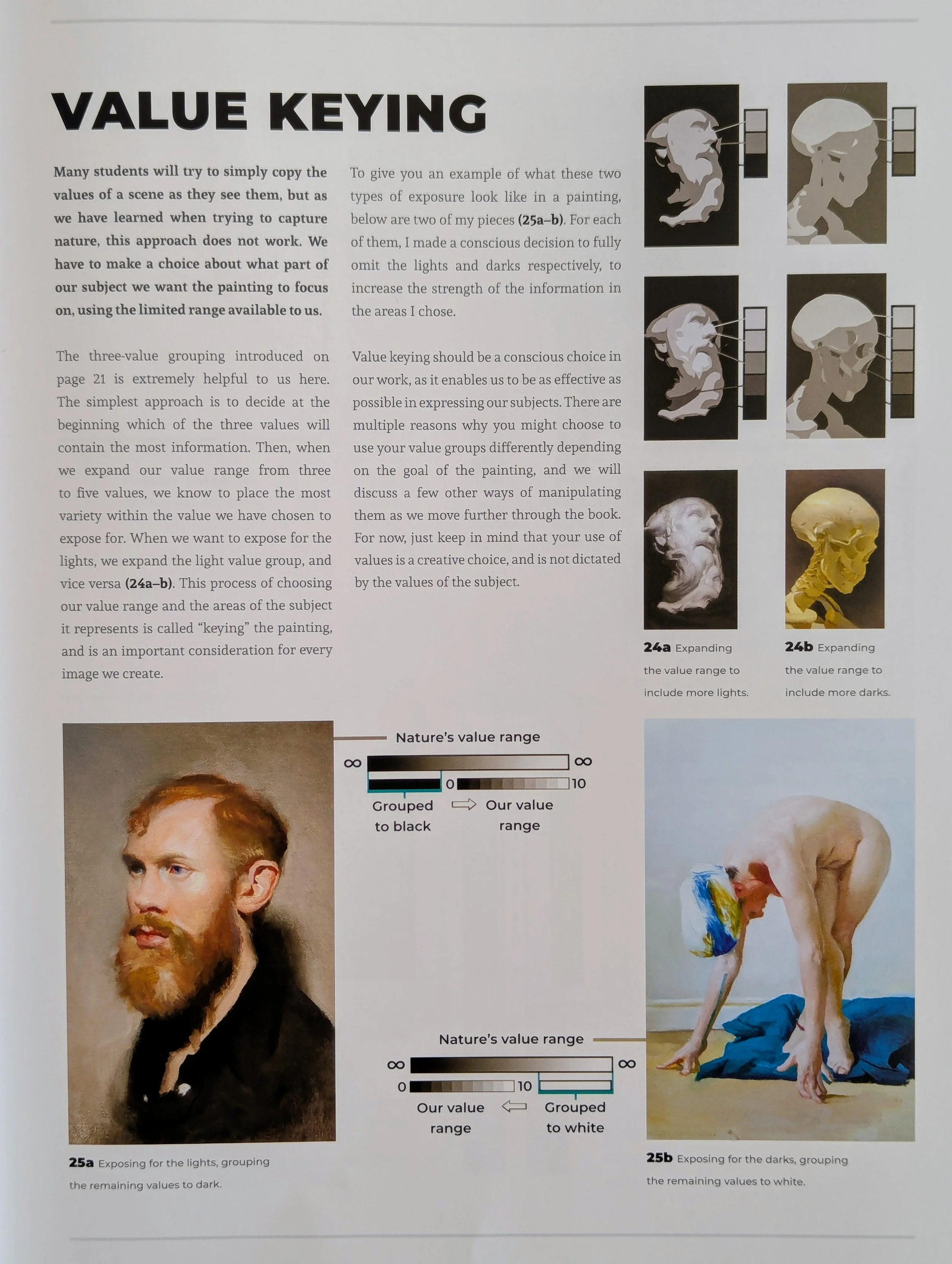
2. Choose a value range (called "value keying"), exposing for lights or darks.
Another revelation was the fact that nature contains a much wider range of value than we can possibly capture in art, regardless of what materials we use. White paint will never be as unbearably bright as the sun, and black paint - which still reflects some light - will never be as dark as the void of space.
Instead, we have to create the illusion of extreme brightness or darkness through value keying. Clump the bright values together with details in the dark areas, or vice versa. This creates the impression of darker darks and lighter lights, despite the limitation of our materials.
3. Paint for value OR color, not both.
There's also a much wider range of chroma in nature than we can possibly capture in art. Even with pure pigments, a painted rainbow will never be as vibrant as a real rainbow.
So once again, you have to create the impression of saturated color by limiting your range of values while expanding your chroma. This approach will ensure that the bright colors look brighter and grab attention rather than the shadows.
Conversely, if you DO want your art to have a strong light/dark contrast, limit your chroma. Although you can still create impactful art with a wide range of both values and chroma, picking one is more strategic if you want a particular effect.
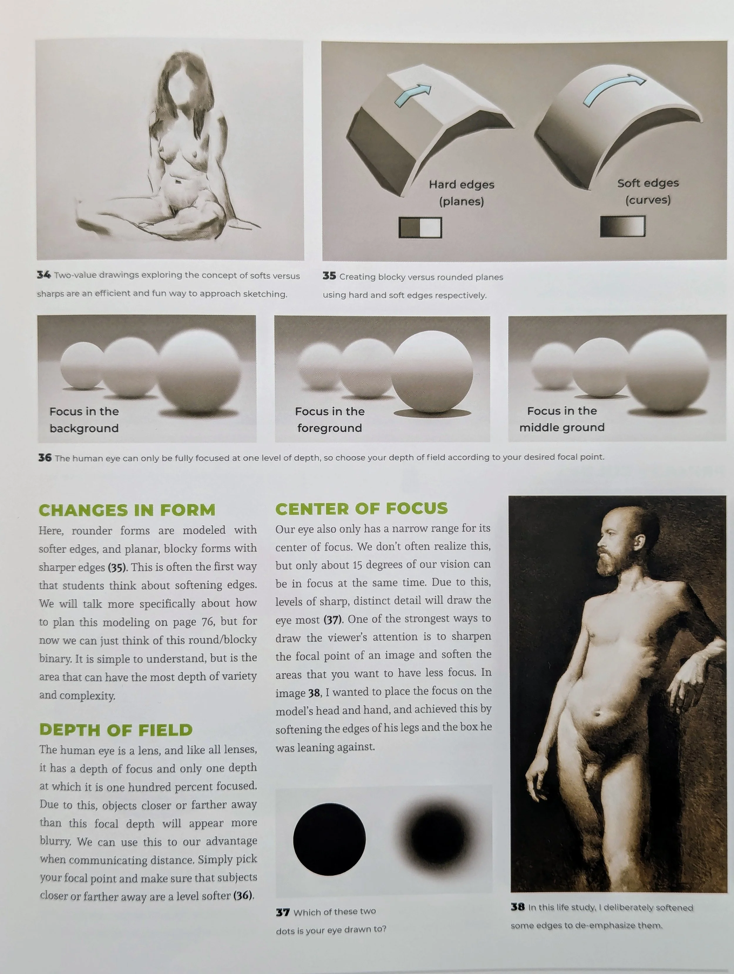
4. Create a center of focus with sharp and soft edges.
“Vision is subjective," Pickard writes. “We don't perceive things ‘as they are’ but rather ‘as they are compared to their surroundings’... Our goal is not to reproduce exactly what we see, as this is often impossible and only gives us superficial results.” Instead, choose what you want to emphasize, and create your image around that goal.
For example, our eyes constantly create a depth of field, focusing on certain subjects and blurring others. To recreate this experience, intentionally sharpen areas you want viewers to look at and soften areas you want to de-emphasize. This technique also creates a sense of distance with a foreground, background, and middle ground.
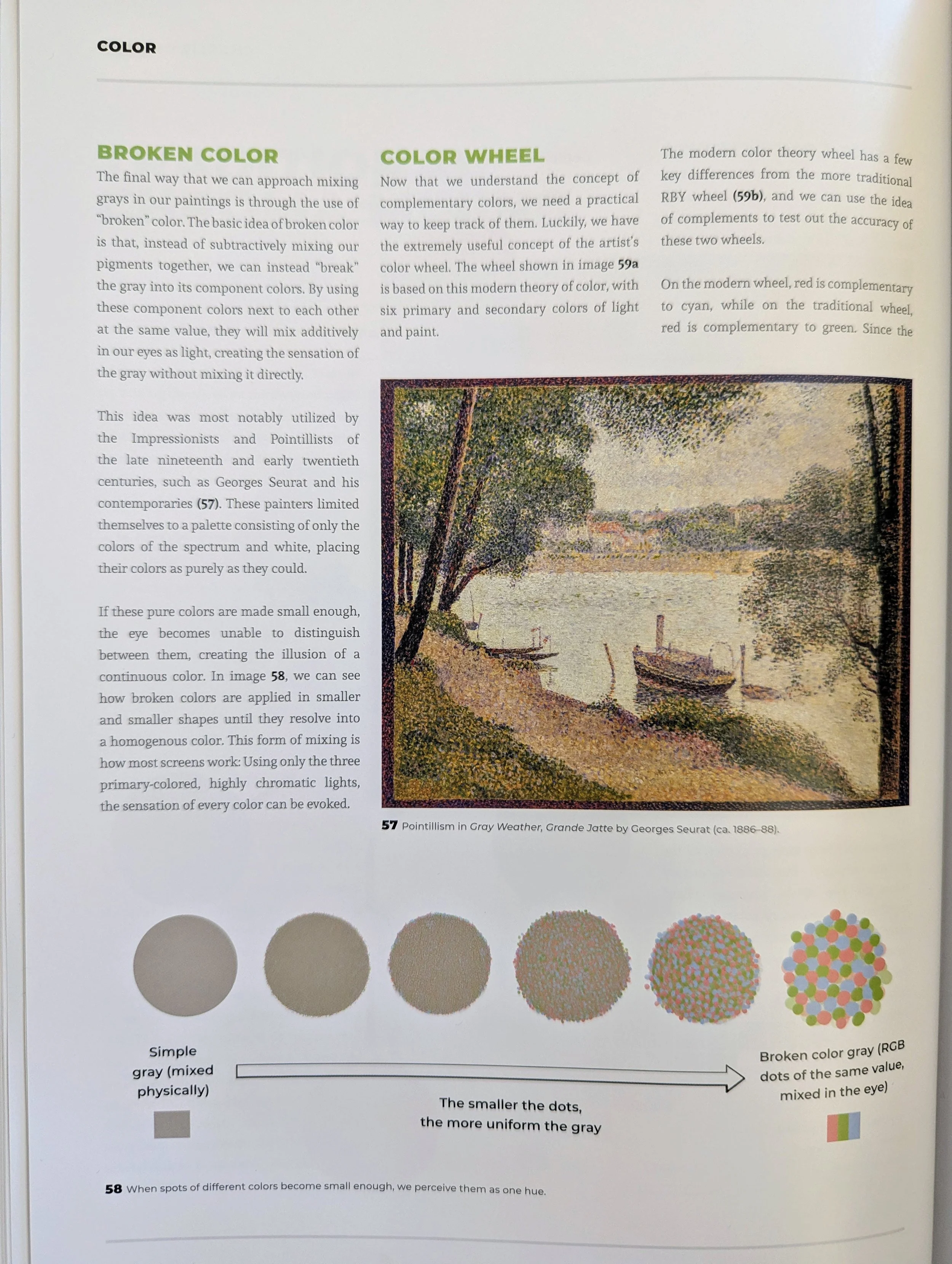
5. Be aware of how colors mix in our vision.
This book is full of optical illusions, but the concepts of impressionism and color assimilation struck me the most. First off, colors mix optically, so even if they're separate on the page, they're perceived together. That's the fundamental idea of pointillism, which creates the illusion of homogenous color by using small dots of different colors, mixing optically.
Nathan Fowkes uses a variation of this idea in his art, presented as a tutorial in the book. To create a neutral background that isn't boring, he uses strokes of different hues that appear neutral together. That allows a neutral background to also be rich with color.

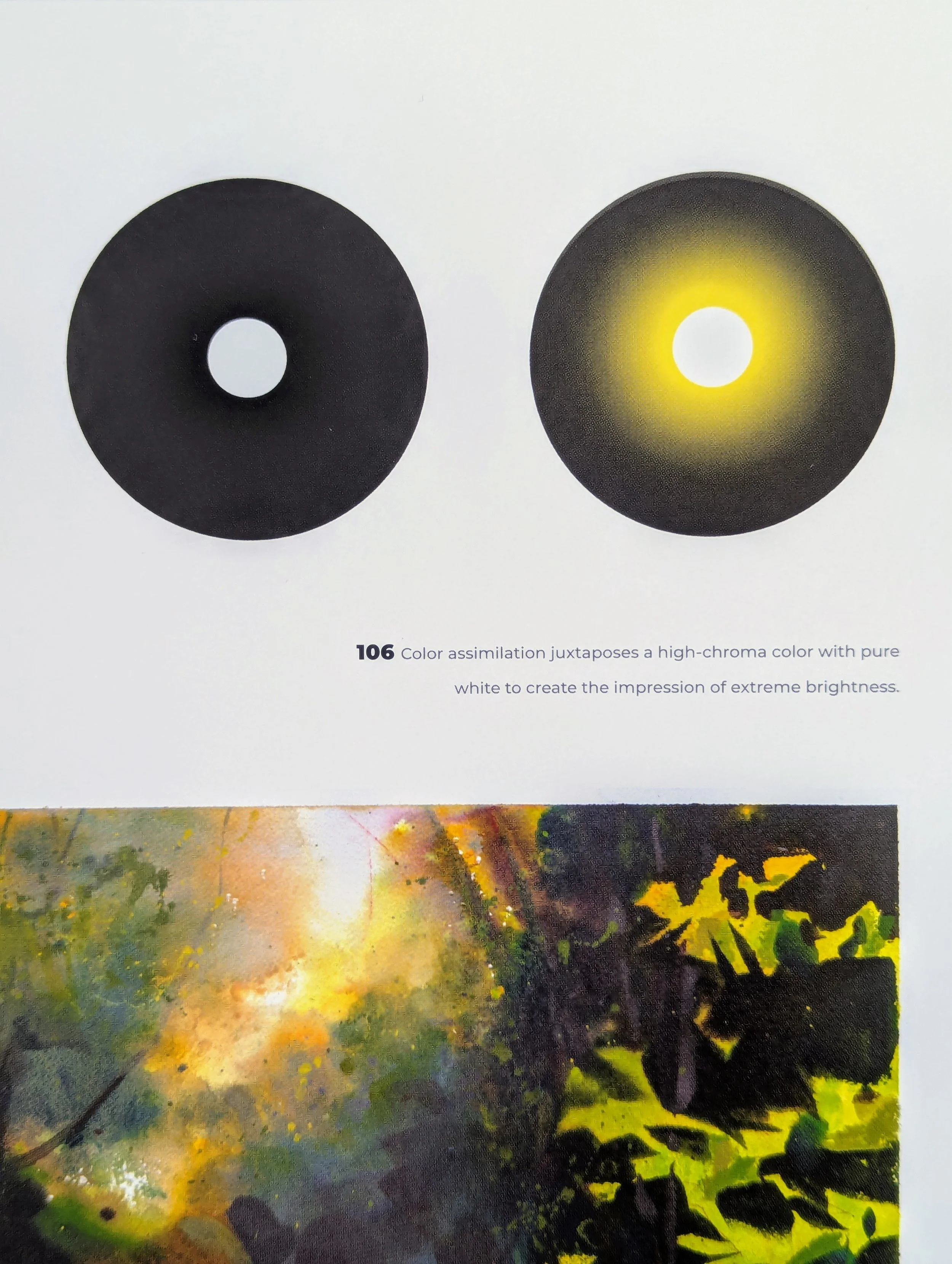
Another variation of this idea is “color assimilation,” when vibrant colors bleed into neutral colors in our vision. It's a wonderful technique for capturing bright lights. Simply place chromatic colors next to pure white, and you'll get a much brighter effect than if you actually mix those colors together.
6. Pay attention to ambient color.
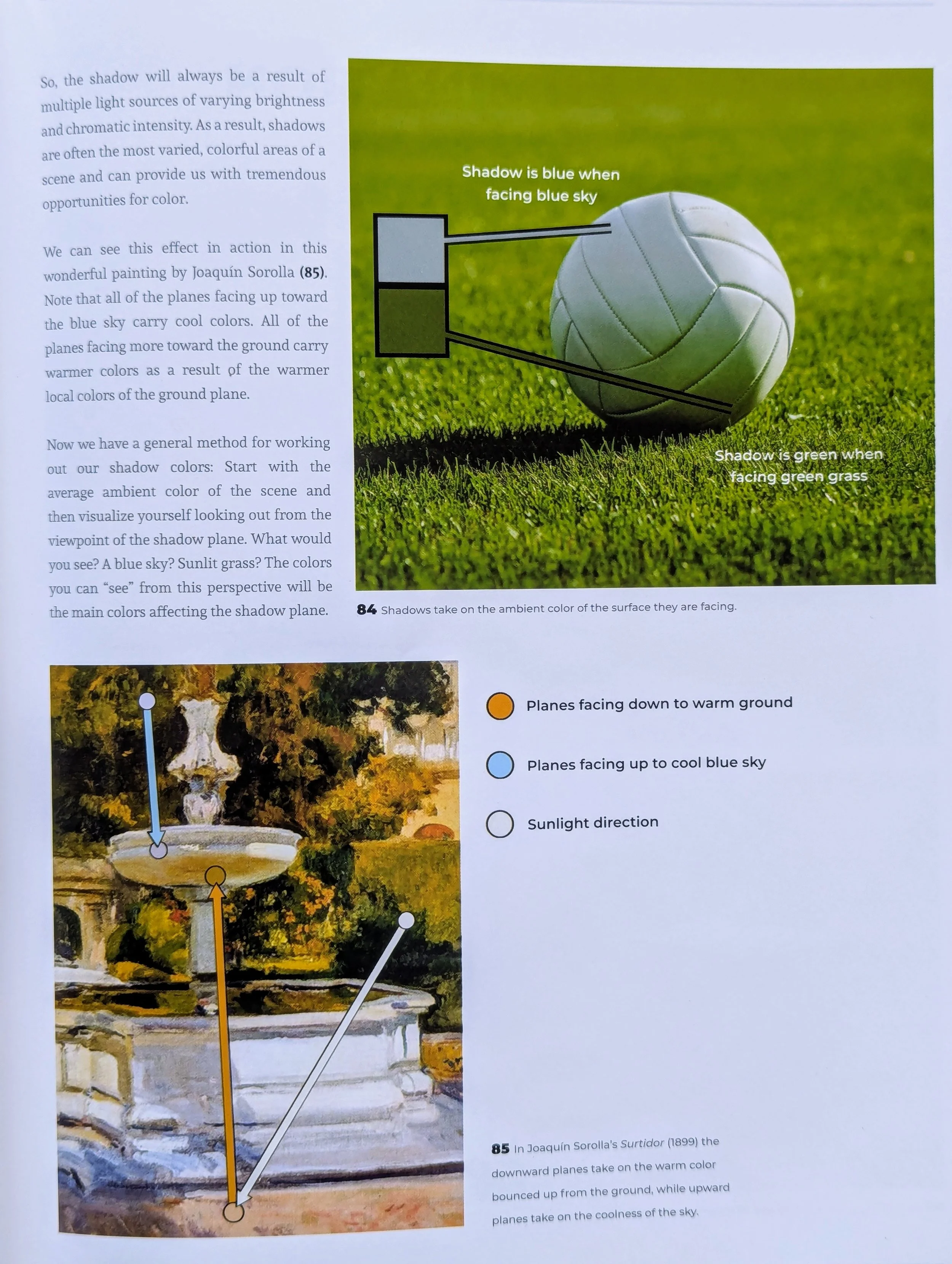
This book helped me notice how much ambient color can impact a subject, especially light from the sky and ground. Despite being at a distance, a blue sky will create blue ambient light that's especially visible in the shadows. Ditto for green grass.
I sometimes simplify shadows, but in fact, they're quite complex in color because they pick up a lot of ambient light from the ground and sky. As Pickard points out, "shadows are often the most varied, colorful areas of a scene.”
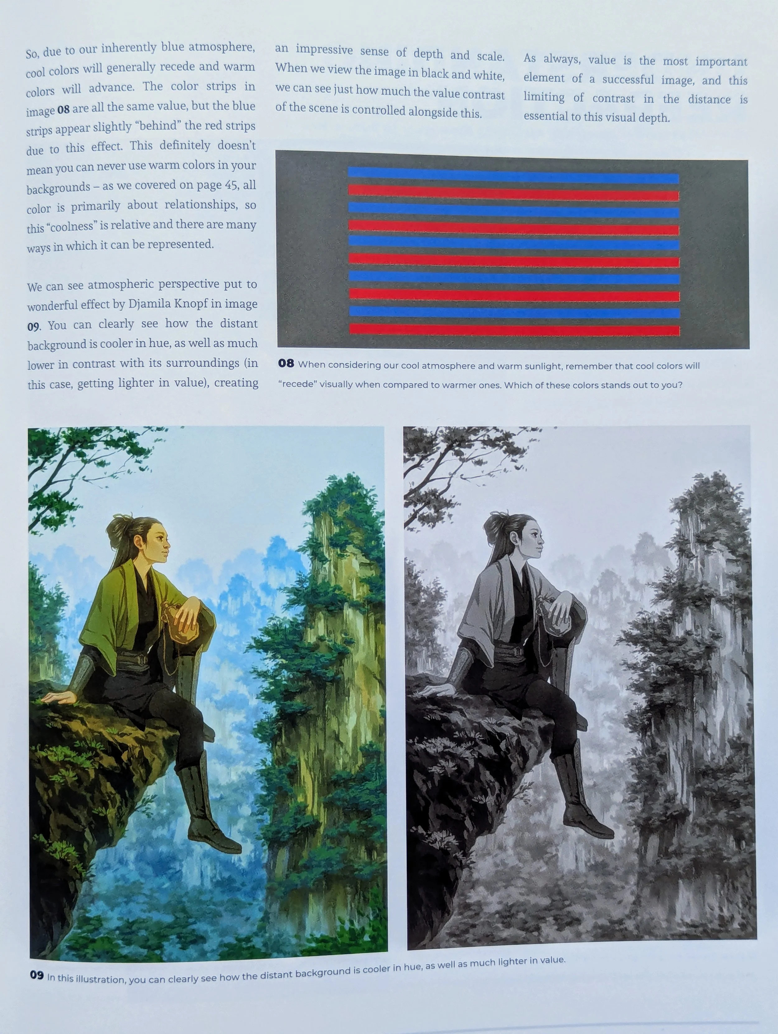
7. Cool colors recede into the background; warm colors advance to the foreground.
This concept is related to atmospheric perspective, or how the atmosphere influences how subjects appear in the distance. The atmosphere makes distant objects appear hazier and cooler in color (like the blueness of the sky).
For this reason, cool colors typically appear farther away than warm colors. Even if a subject isn't actually far away, you can make it recede into the background by cooling down its colors. Or vice versa.
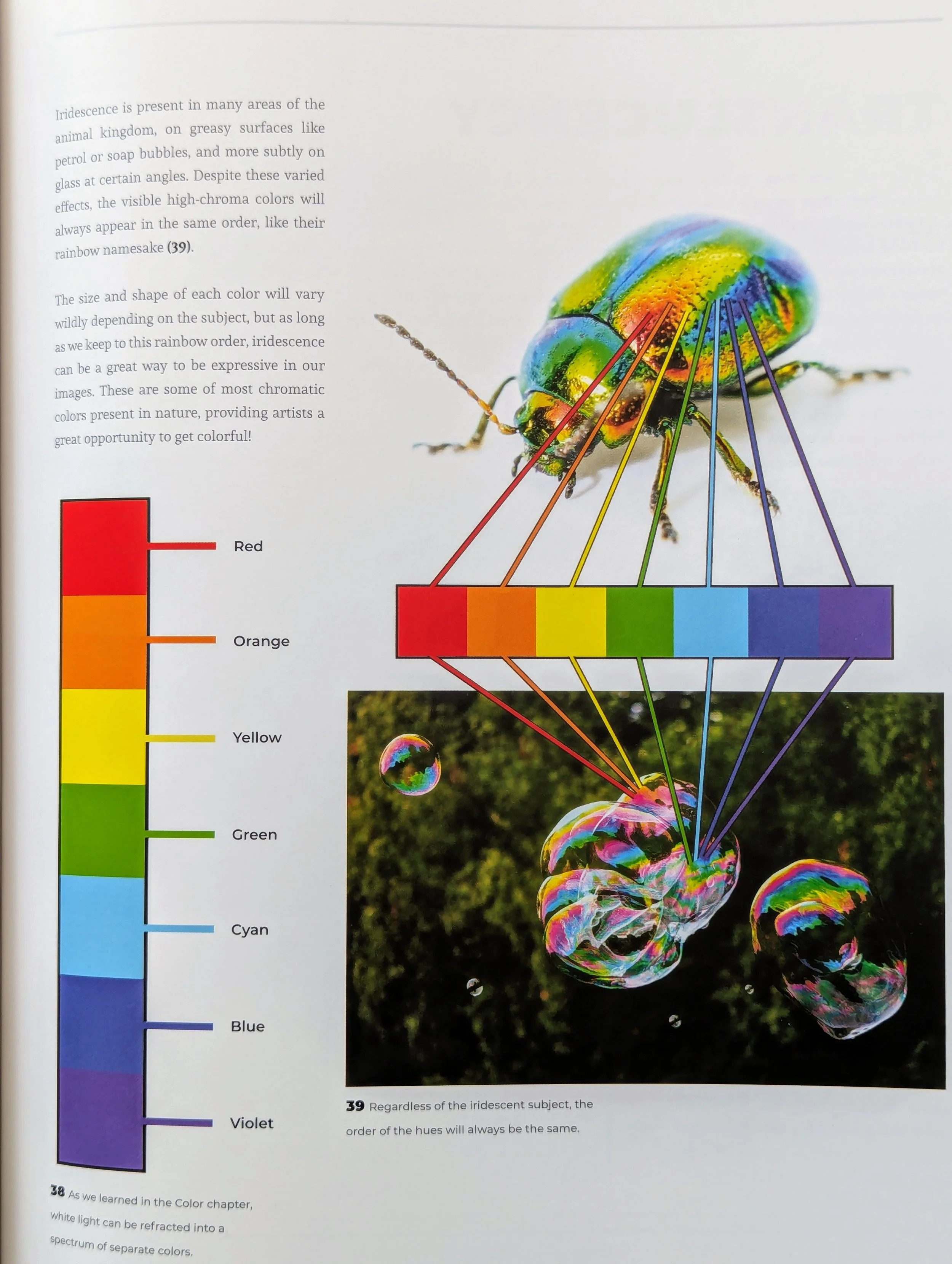
8. Iridescence is unpredictable, but the colors always appear in the same order.
In case I ever become obsessed with painting bubbles, I'm keeping this fact in mind. No matter how random iridescence may look, it's actually just a rainbow in chaos mode.
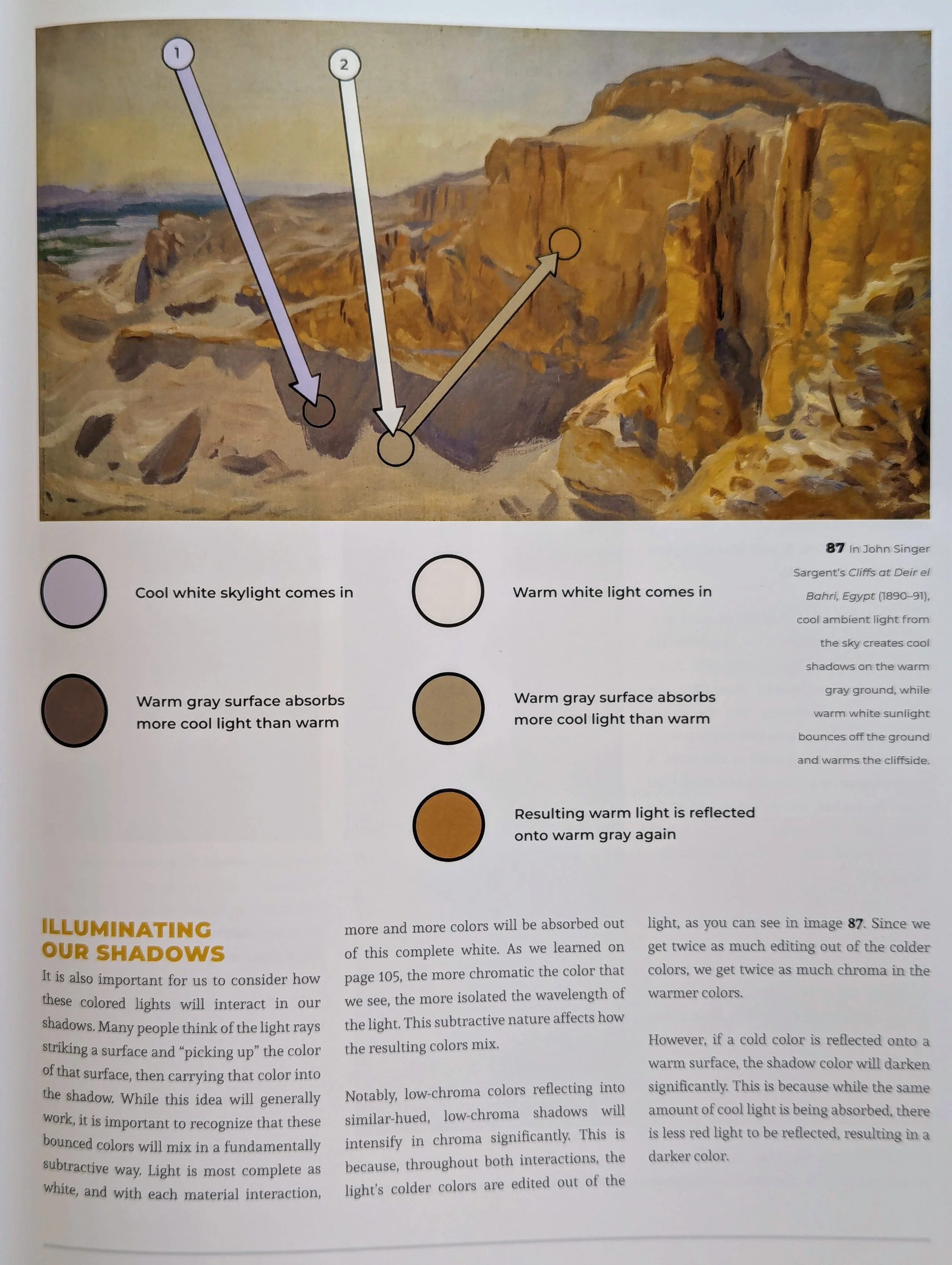
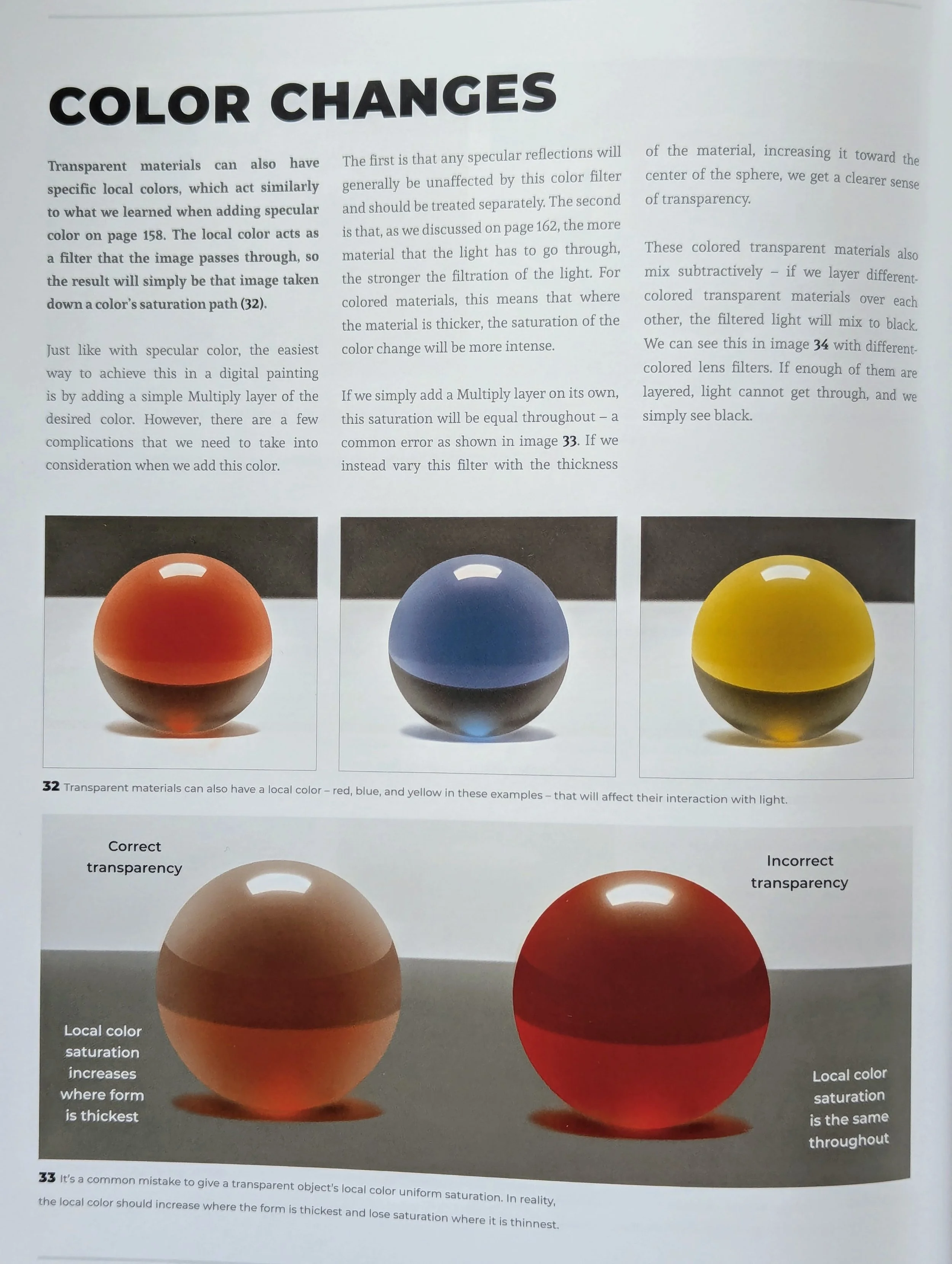
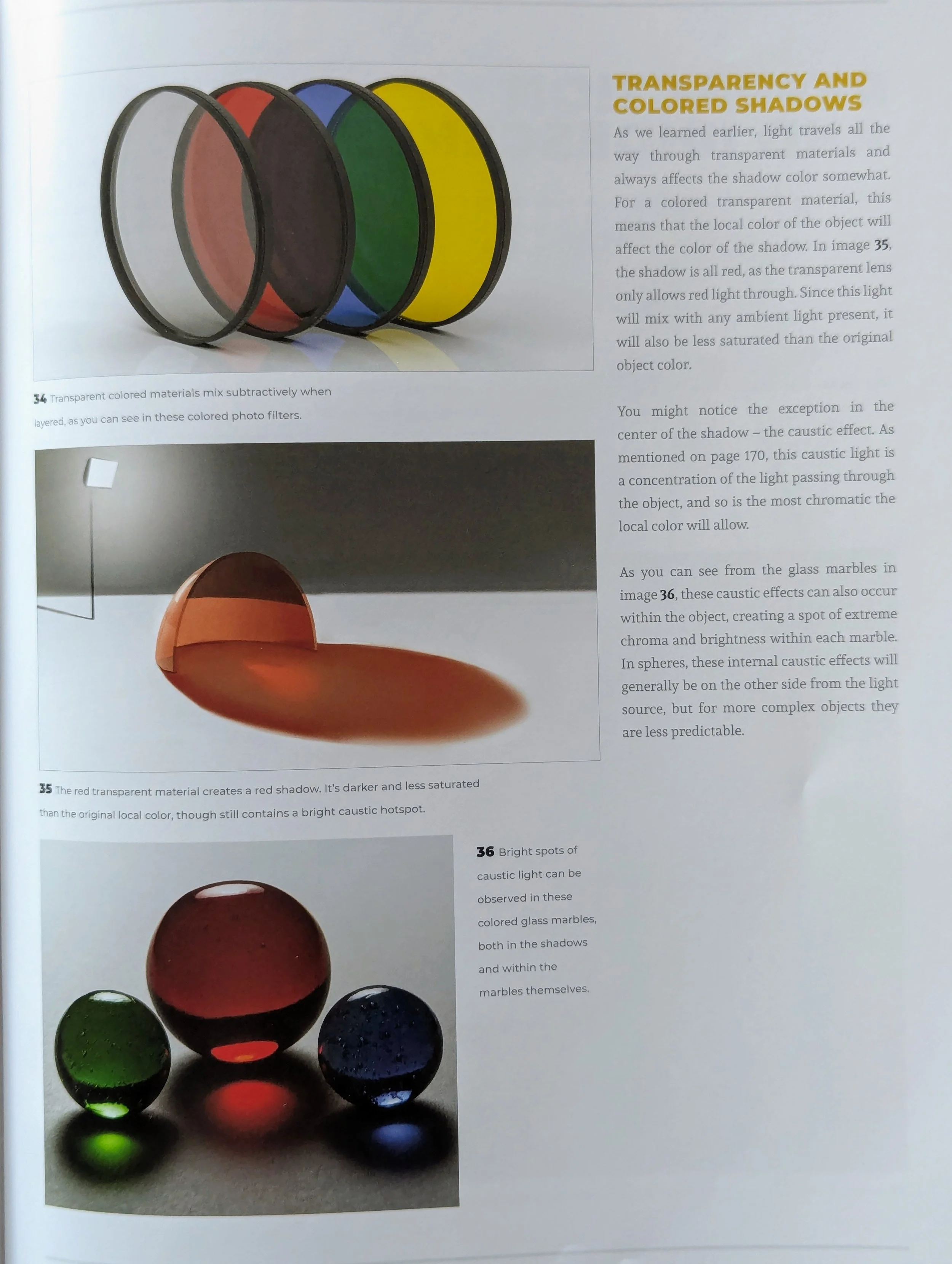
9. Translucency impacts the color of shadows.
This one melted my brain a bit, but basically the shadows of transparent, translucent, and opaque objects all look different. I don't feel like writing down or frankly remembering the particulars, so I just put the pages here for reference. My main takeaway was that it's important to look carefully at shadows because they're sneaky and colorful. Don't assume anything.
Also, caustic light is awesome.
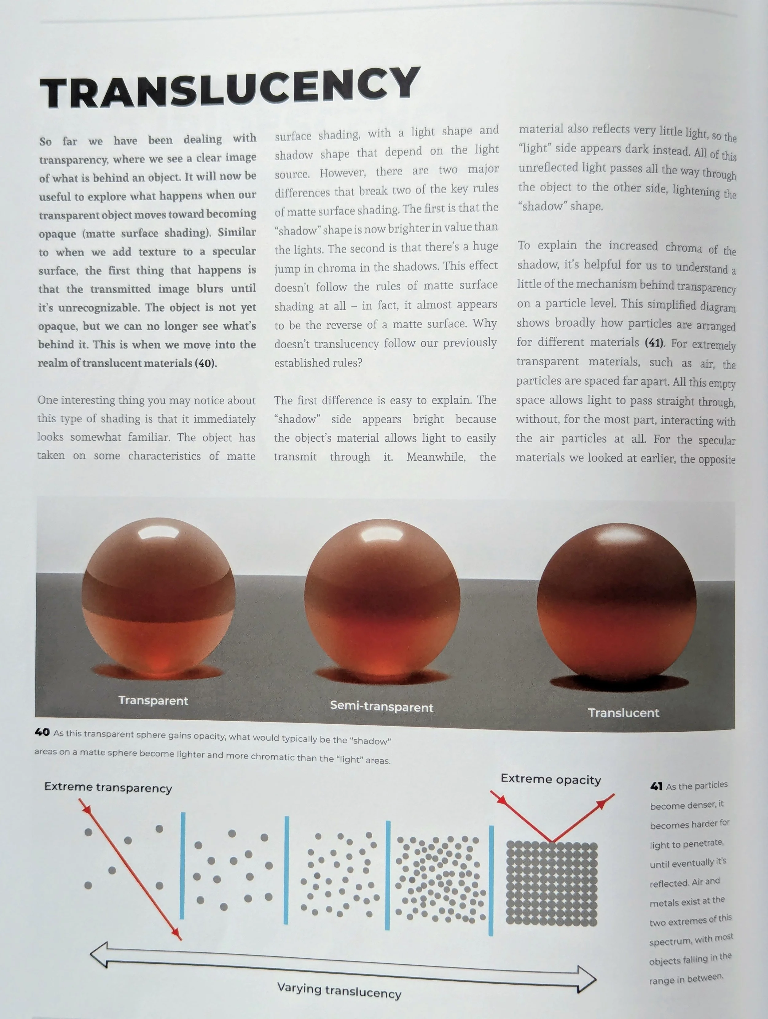
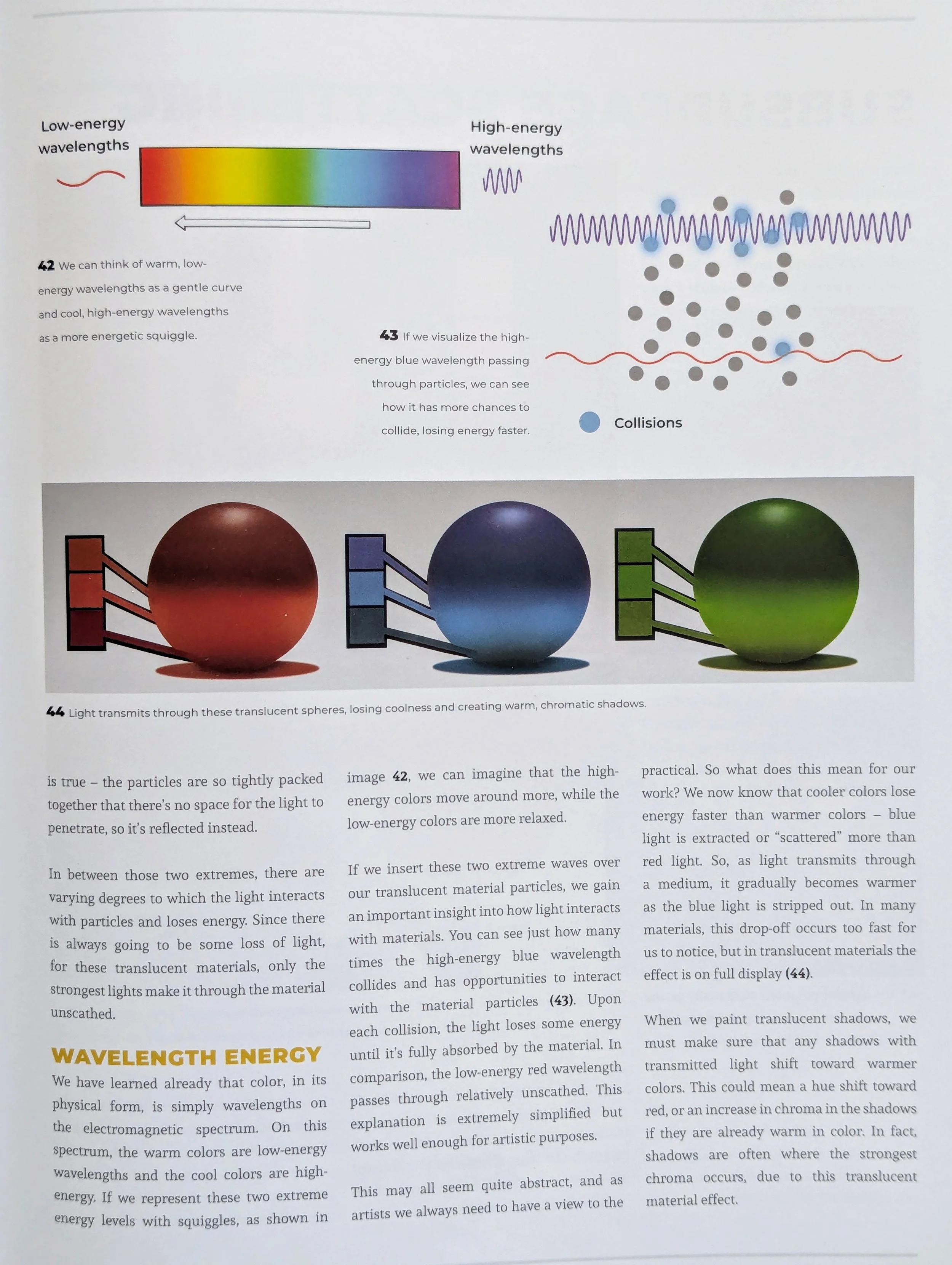
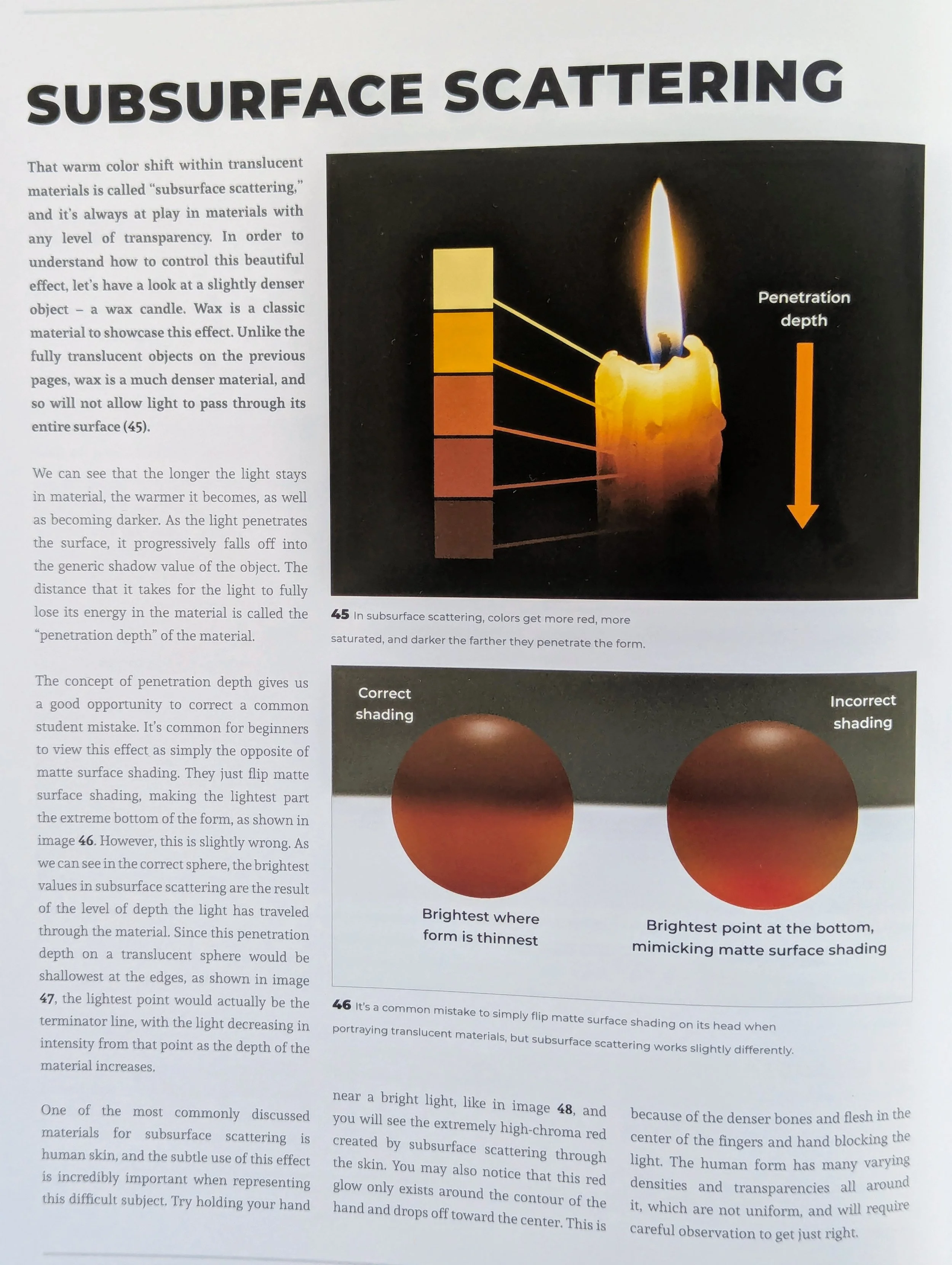
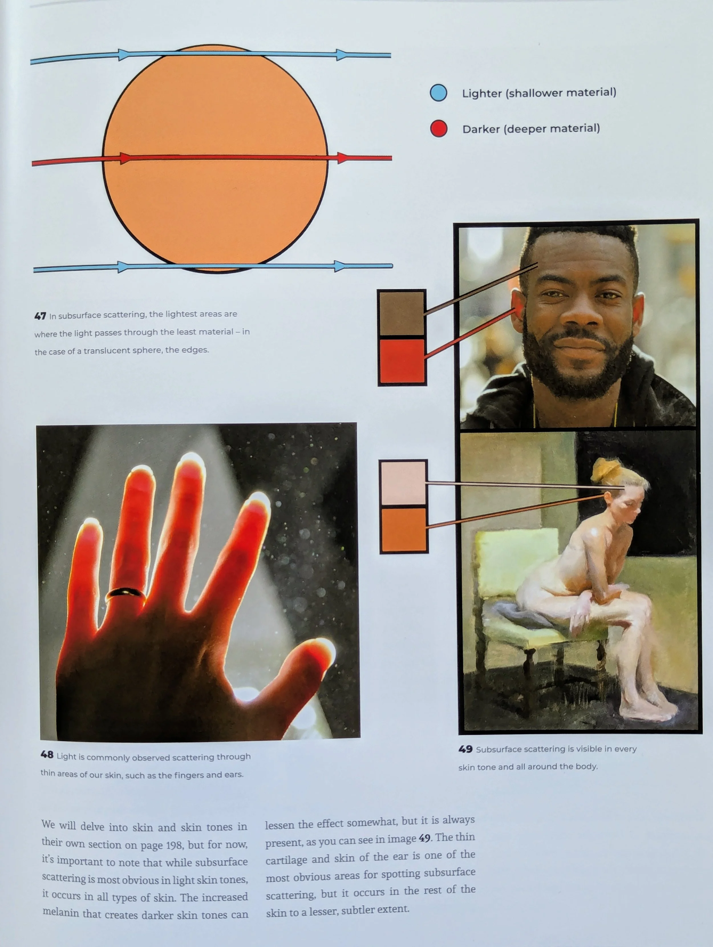
10. Notice the warm shift within translucent materials, i.e. “subsurface scattering.”
When light scatters through something translucent like thin wax or skin, it's easy to see the brightness of the light. But also notice how the colors get redder and more chromatic as they darken. Light sometimes looks cold, but subsurface scattering always has warmth.
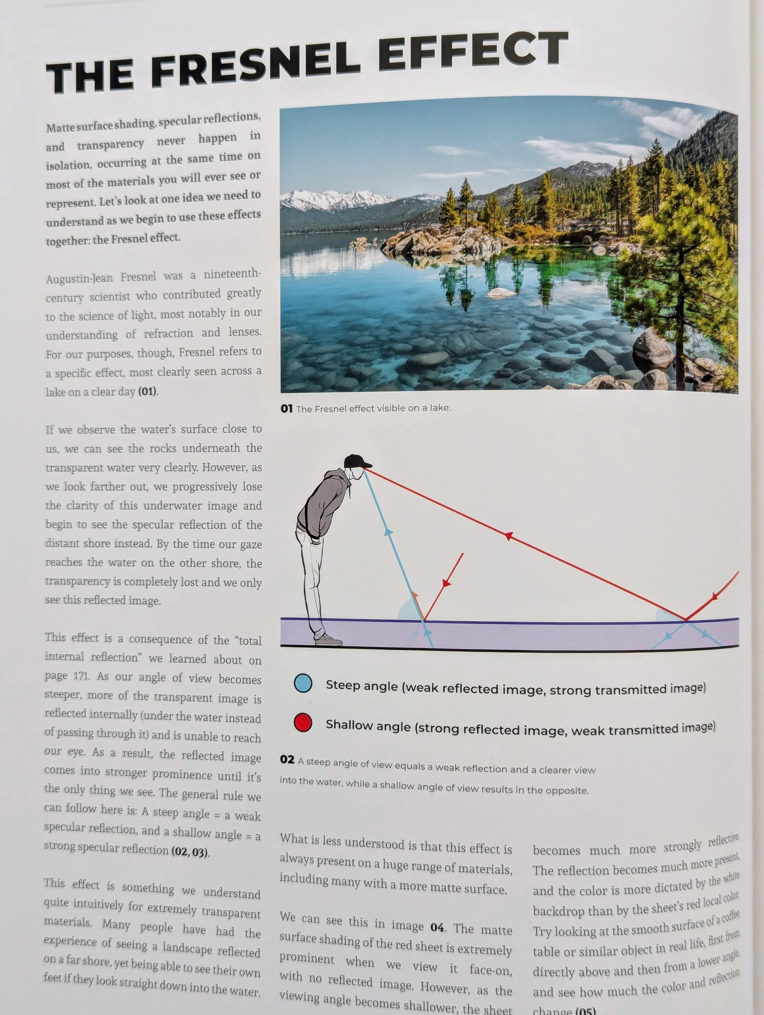
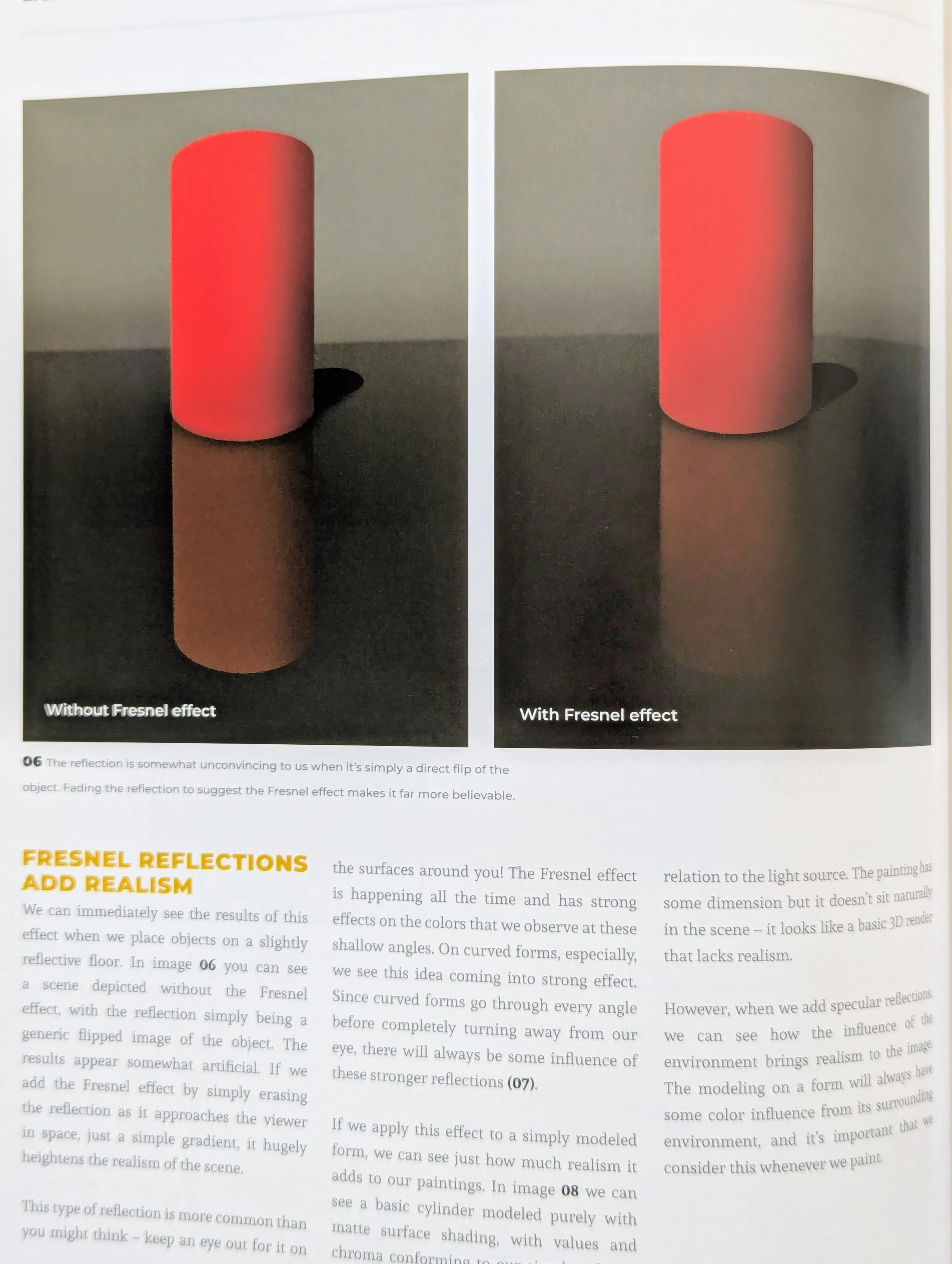
11. Fade reflections for realism (the Fresnel effect).
Steep angles make weak reflections. Shallow angles make strong reflections.
That's the basic principle of the Fresnel effect, observable in lakes, glasswork, tabletops, and everything else that's specular. Whenever there's a reflection, no matter how subtle, note how it fades as its angle to you steepens. Without that fade, the reflection will look unrealistic.
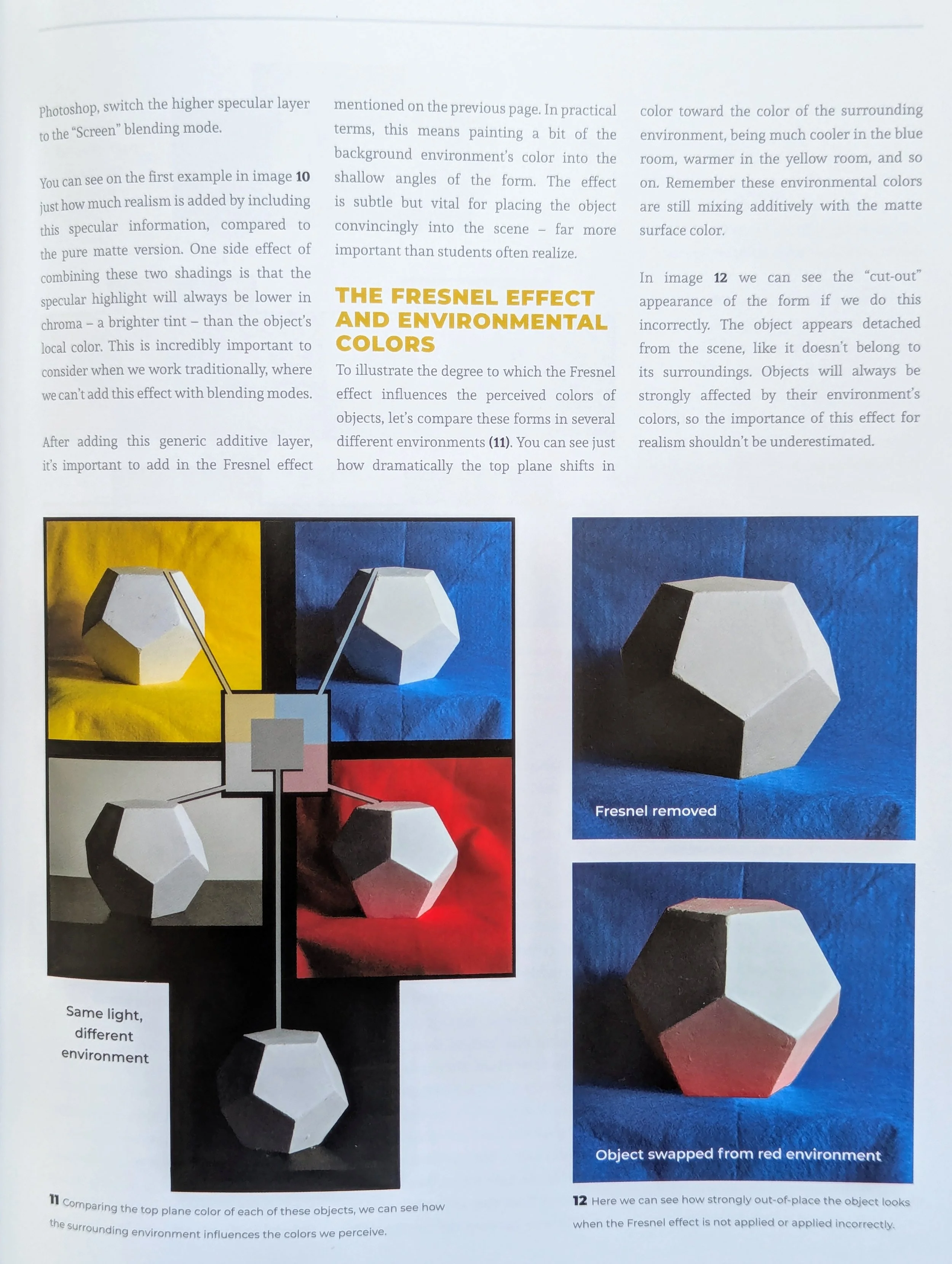
12. Paint ambient colors additively with the Fresnel effect.
Ambient colors are reflections of light, so the Fresnel effect applies to them as well. Moreover, the mix of ambient and local color will be additive (getting lighter) unless the background is black. Mixed additively with black, colors remain constant.
Previously, I saw that additive effect as ambient light from the light source. While that's technically true, the effect is coming from the background, not the primary light source. Change the background, and the colors will transform.

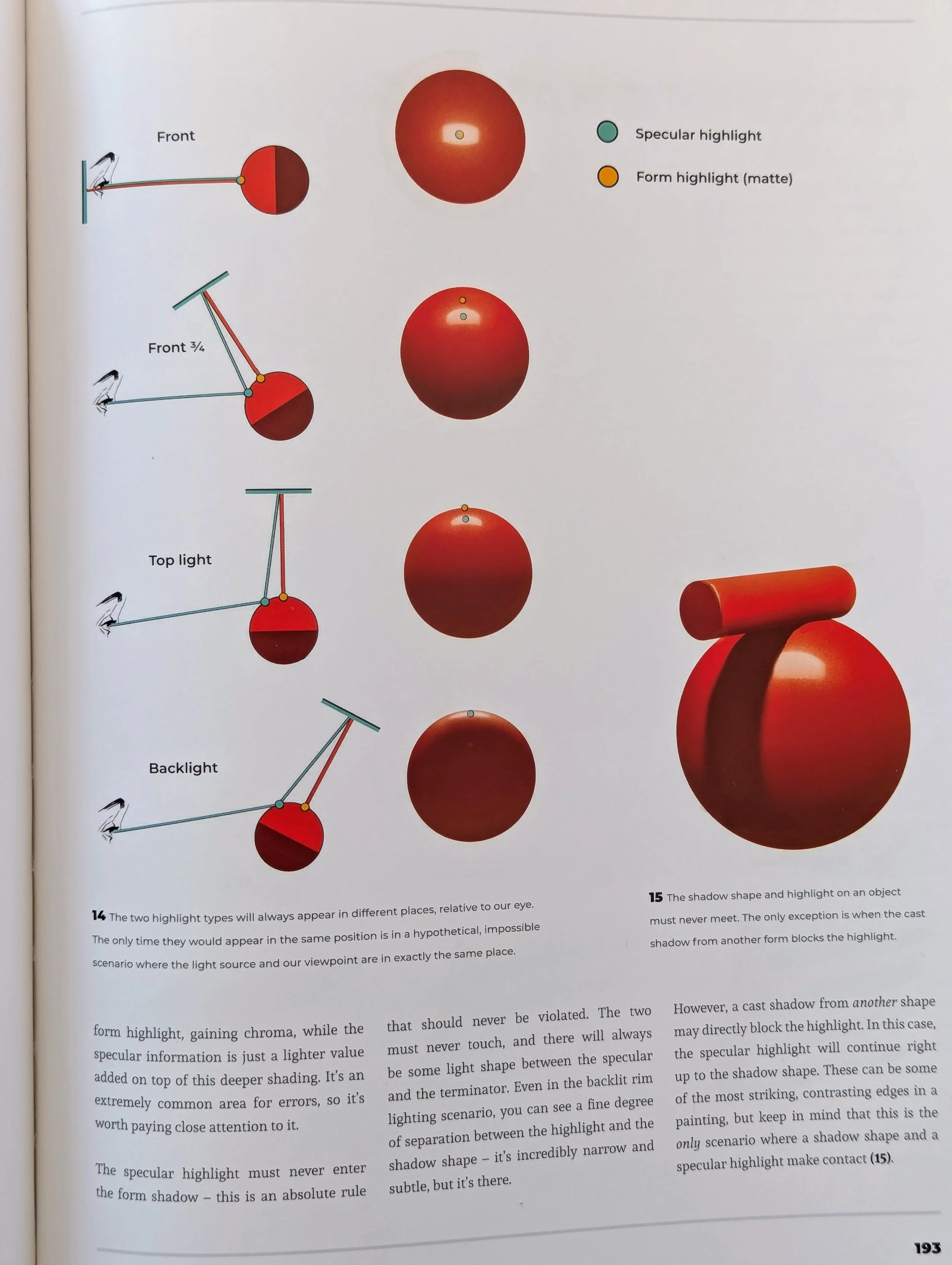
13. The specular and form highlights are close together, but still separate.
This lesson verges on OCD, but since it was interesting, I took note. The specular highlight (the point of highest value) is different from the form highlight (the point of highest chroma). They're often close together, though, so a common mistake is to place them exactly in the same spot.
The only scenario where the two highlights would align would be if the viewer were also the light source, like with glowing eyes. Otherwise, the relationship between the viewer and the light source determines the specular highlight (exactly like a mirror), while the angle between the subject and light source determines the form highlight.
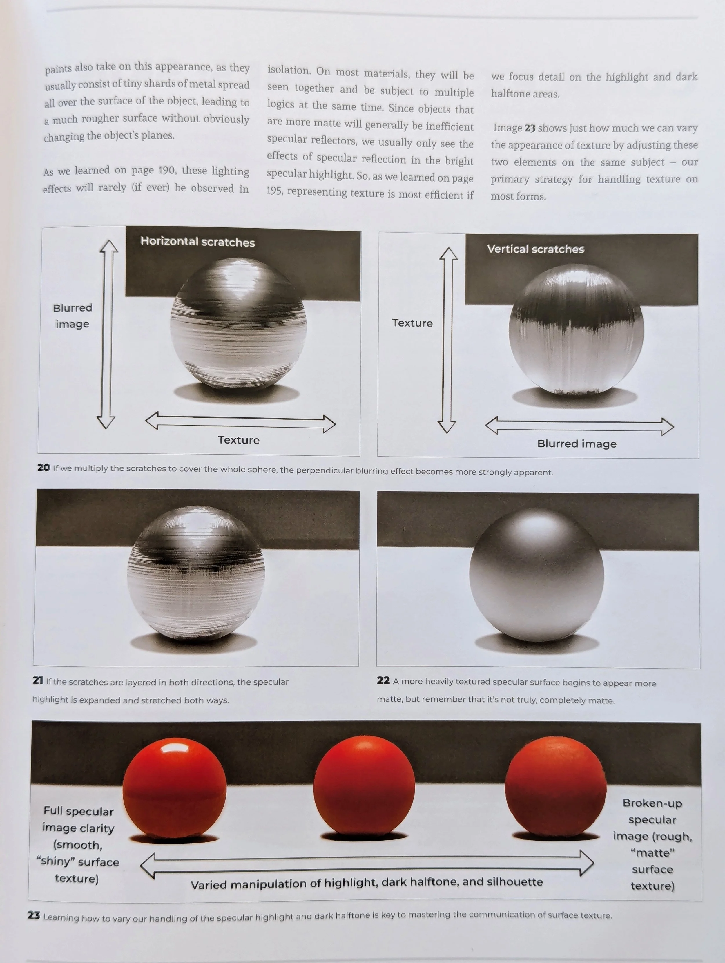
14. Create texture by manipulating the silhouette, highlight, and dark halftone.
In the past year of practicing art, the biggest lesson I've learned (and continue to learn) is the power of simplicity. A lot of detail can be communicated in a few brush strokes, since our brains recognize patterns and naturally fill in the blanks.
The tricky part is knowing where exactly to put those strokes. That's why this advice was so helpful. No matter how textured a subject is, you can simplify it by focusing on the silhouette's shape, the highlight's intensity, and the details in the dark halftone.
That's because light conceals texture. The brighter an area is, the less texture you'll see. The shadows (or dark halftone) are where you'll find the most texture.

The final third of the book has tutorials and artwork by various artists, demonstrating the aforementioned concepts in different ways. Though I picked up some useful tips in those sections, I didn't get as much from the tutorials about digital art, since I only work with traditional materials.
Fortunately, the bulk of the book is by a traditional artist, Charlie Pickard. The other artists build on his explanations so you can see how they're relevant for digital art. After a depth of explanation, it was also refreshing to look at stylized images from artists who work more intuitively. It reminded me that you can still make cool art even if you forget all the science behind it.