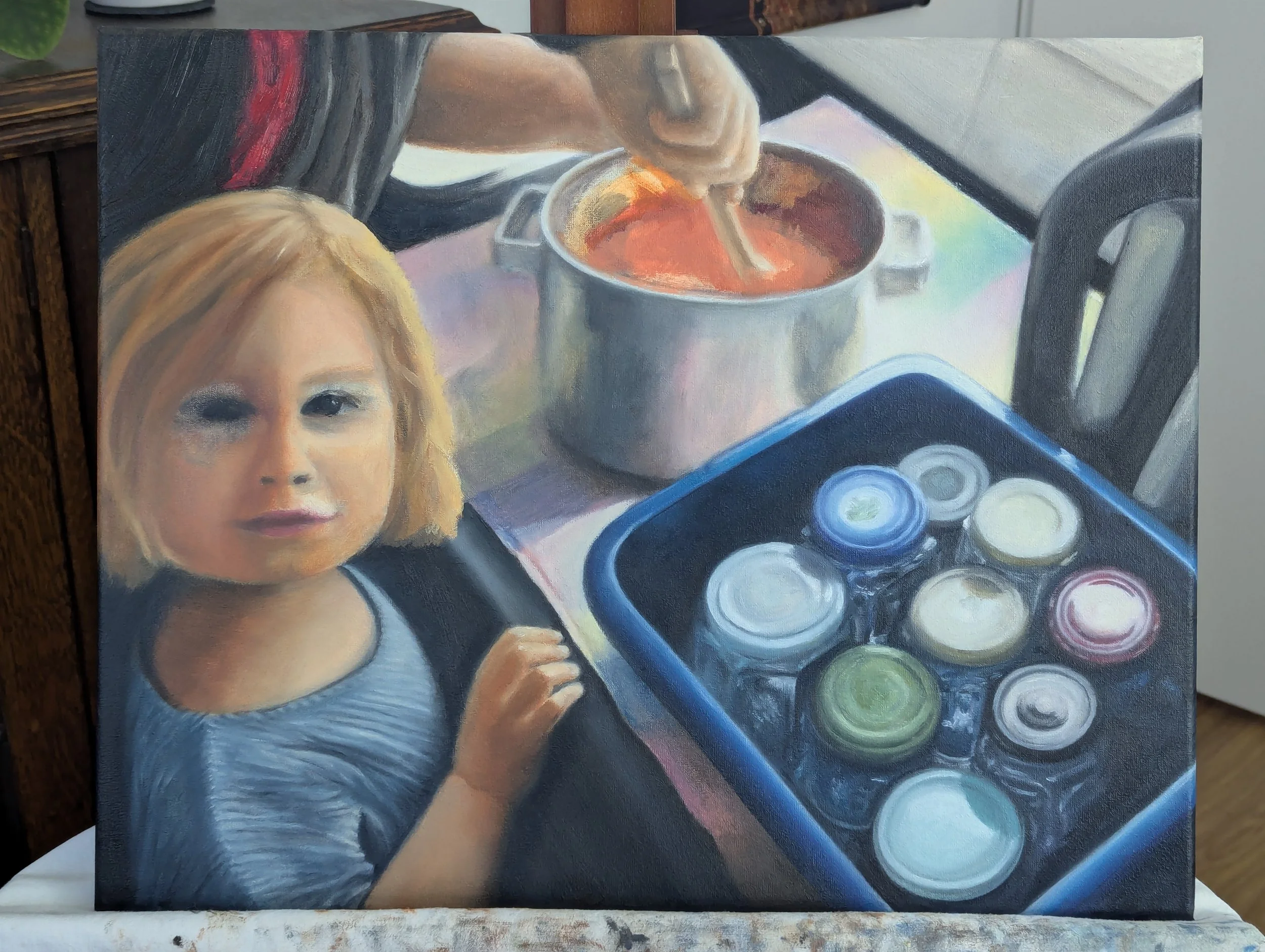
"Strawberry Season” - Oil Painting of Child and Grandma Making Jam
“Strawberry Season” (oil on canvas, 40 × 50 cm)
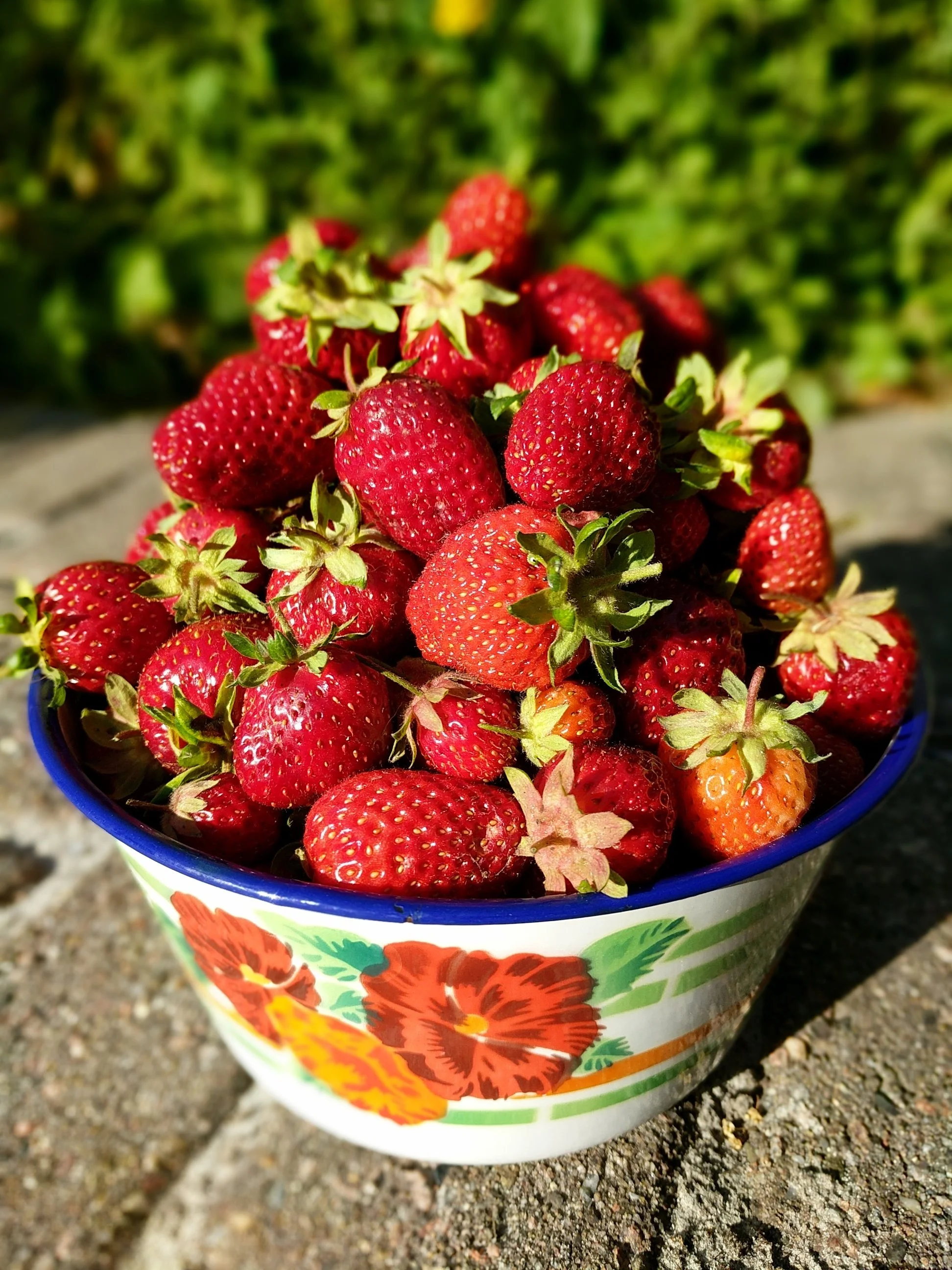
“Strawberry Season” is my third painting in a series called Fear/Love about conflicting emotions, darkness and light. I made this painting as a birthday gift for my father-in-law who, over the years, has grown and harvested buckets upon buckets of strawberries, often cooked into strawberry jam and canned by my mother-in-law.
Besides strawberries, my in-laws also grow apples, blueberries, red currants, and lots of beautiful flowers: tulips, sunflowers, hollyhock, rows of wildflowers… Too many to name, plus all the plants inside the house!
It's a lot of work. Every year, there's a flood of fruit that has to be plucked and preserved, as well as seeds to plant, weeds to pull, and grass to mow. Hours of labor.
It's peaceful work, though, and summers in the Netherlands are so temperate, it's pleasant to be outside all day when it's sunny. Caring for the garden is exhausting yet relaxing at the same time.
Garden work was especially peaceful during the pandemic when we lived together for almost two years, sharing childcare, housework, and of course, strawberry picking. While crouching beside the strawberry patch or making strawberry jam with my daughter, it was easy to forget we were in a lockdown.
Though serene, the work was still tiring and time-consuming. I was happy to help out, and also happy when it was over - a mix of emotions I've seen in every gardener who grows and preserves food.
In honor of all the time my in-laws have dedicated to their garden (as well as all the homemade strawberry jam I've enjoyed because of it), I wanted to capture the peaceful labor of strawberry season in a painting, done right in the midst of that season.
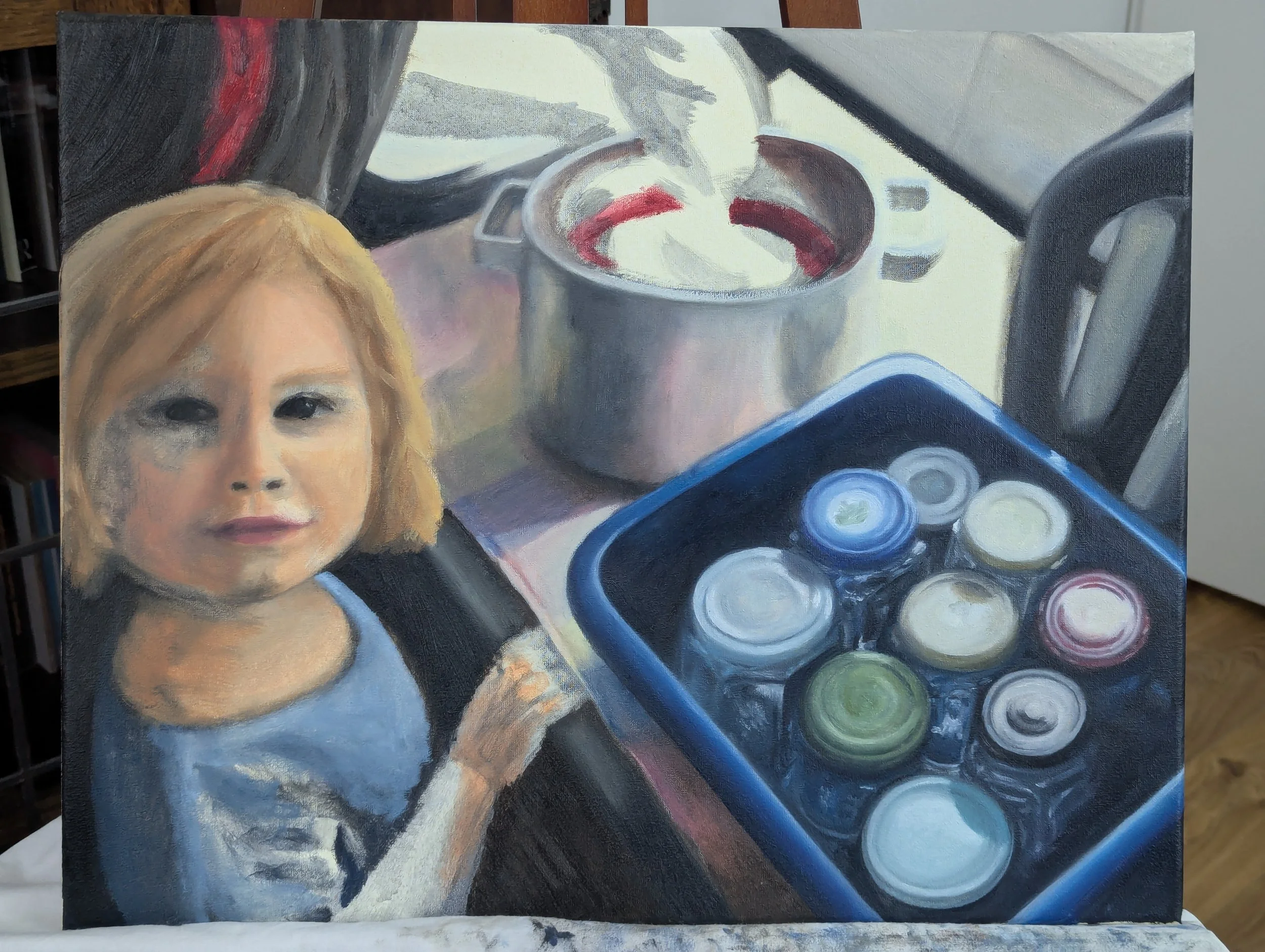
I chose a video of my daughter canning strawberry jam with my mother-in-law to use as a reference for the painting. I considered using a photo or video of the garden itself, but I loved how the sunlight from the kitchen window created a dark/light contrast, especially in the tub of jars. I knew my father-in-law would like the scene, too.
The Process
Since the video and canvas were different sizes, I started off with a quick sketch on paper, focusing on the light/dark values and proportions of the canvas. I pared the image down to the values because I'd recently learned how pivotal they are, even more important than color. (See my review of Color & Light for more on that.)
I also put the rough sketch on the canvas itself in acrylic, just to stay on track and avoid getting lost in colorful details as I occasionally did while painting “Opa's Bench."
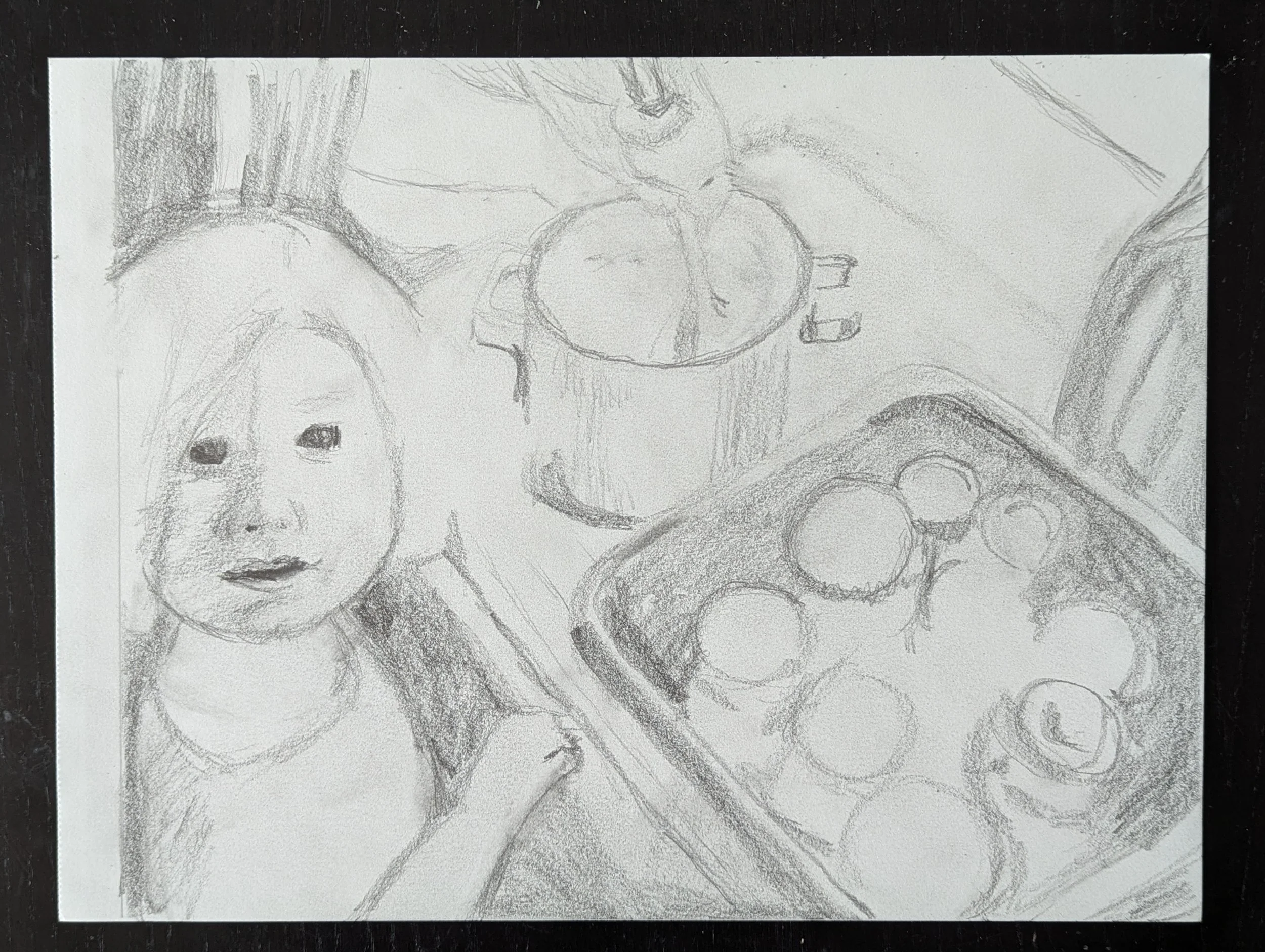
Using a quick, light/dark sketch as an underpainting was very helpful, but retrospectively, I should've used a lighter shade for the dark sections. Although thick oil paint can easily cover an acrylic underpainting, I enjoy painting thinly sometimes and letting lighter shades show through like in “Afternoon Nap."
But since I also enjoy working with thick globs of oil paint, I didn't mind the dark underpainting too much. It was a little limiting but otherwise a good structure to work with.
Until now, I've worked primarily with acrylic and gouache paint, but I've been eyeing oil paint because I love how vibrant and luxurious it looks. I've used oil paint a few times for studies but never for a painting I really cared about on canvas. It was intimidating, but I made the transition easier with Cobra water-based oil paints, which are simpler to clean.
Although I love oil paint, it does take a different approach than fast-drying paints which can be layered repeatedly in one session. Oil paint takes so long to dry - days, weeks, or even months - so blending is more common than layering. It's beautiful or an utter mess depending on how the colors mix.
My first session had both experiences. I ambitiously began with the face and adored the rich colors, but the learning curve exhausted me. I ultimately kept only a fraction of my work, scraping off the parts that frustrated me the most.
I also ended up with a migraine, which often happens whenever I intensely learn something. Lying sick in a dark room with images of oil paint repeating in my mind, I complained to my husband, “I hate how this always happens.”
“It's how you improve so quickly,” he said for comfort, though I'd rather be migraine-free and learn slowly than suffer every time I pick up something new. But anyway, I felt better the next day and had a fun second session.

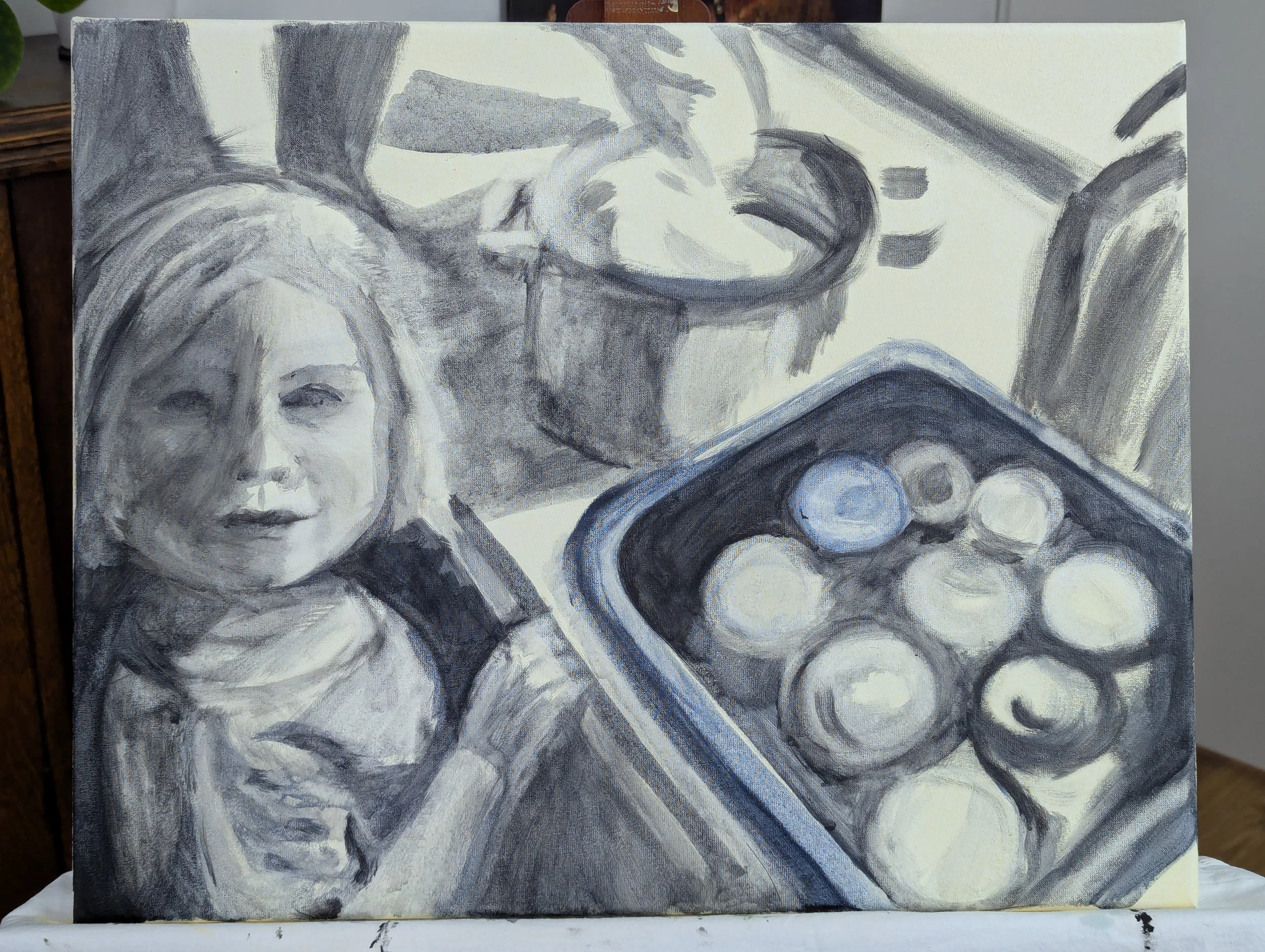
It helped that I kept the session relaxed, working on simpler subjects - the apron and striped cloth - spending time getting used to the paint and puzzling over how much detail to give the cloth. Although I liked the cloth's colorfulness, I didn't like how the colors drew attention and distracted from the portrait.
I didn't quite solve that problem during this session, but I created a good foundation of soft colors (also reflected in the pot) which I later tweaked to be even softer and cooler.

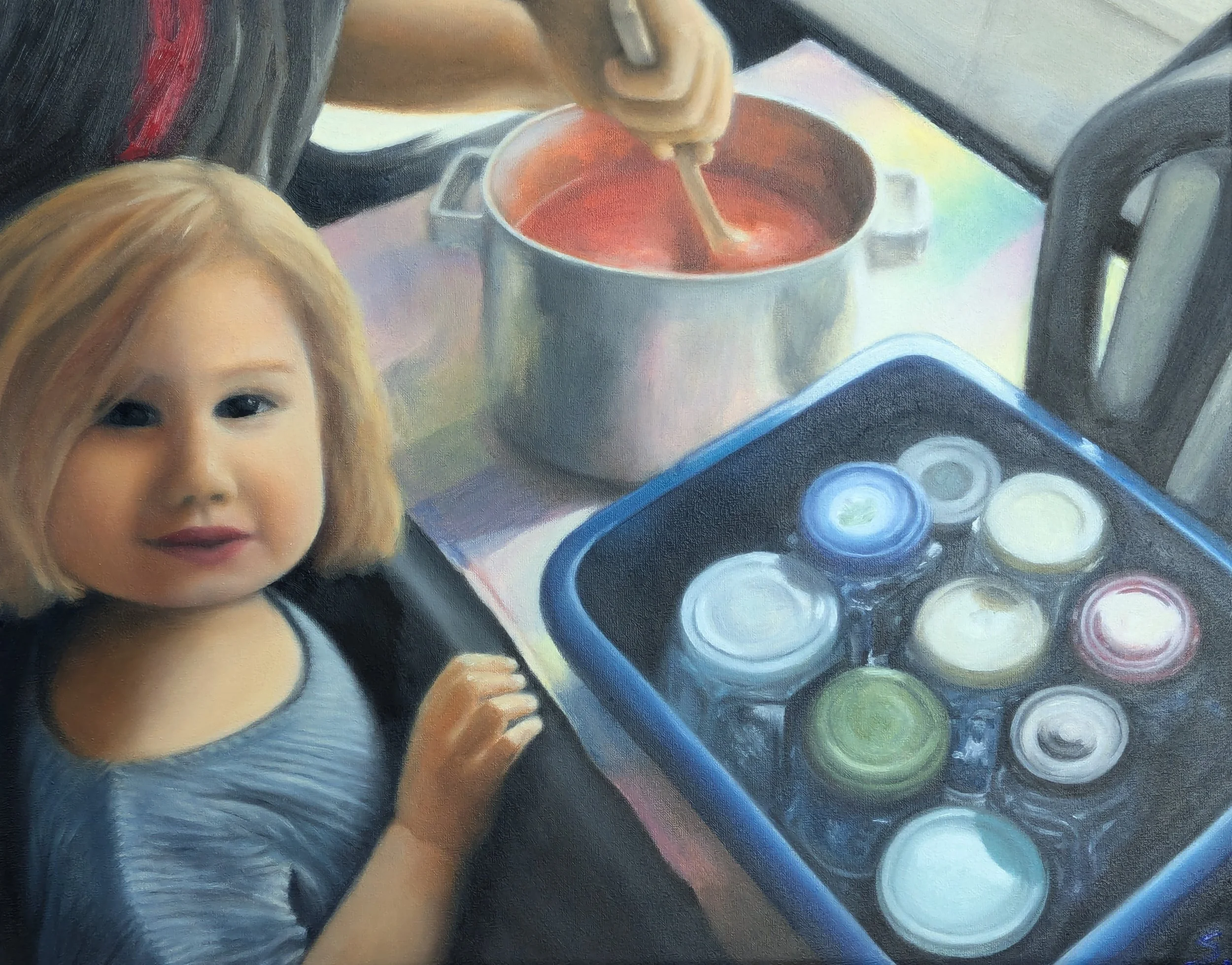
I took a similar approach with the third session, focusing on side details (the sink, tiles, and electric kettle) so I could grow comfortable with oil paint before tackling the primary subjects.
Besides building confidence, taking my time with the secondary subjects had the benefit of giving those subjects more complexity in color. If I'd painted them quickly, they would've lacked the subtle color shifts they have now, which I love.
Though I began the painting with the portrait in mind, I ultimately spent more time painting everything else. I obsessed over the little objects and muted colors like Giorgio Morandi, who painted plain bowls and bottles repeatedly as if they were magnificent subjects, not boring at all.
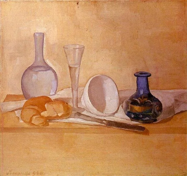
Still Life (The Blue Vase) - Giorgio Morandi
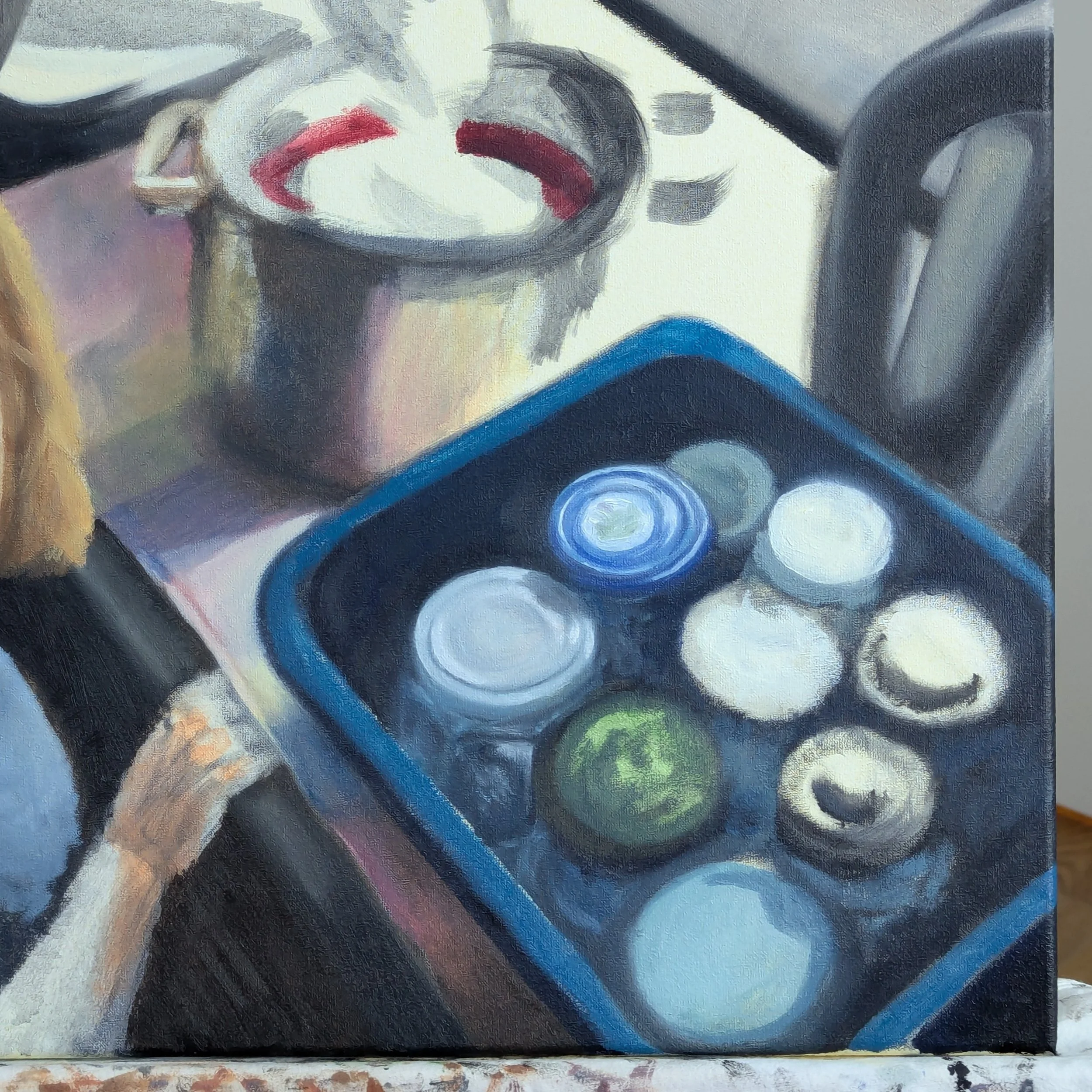
I spent an obscene amount of time doing the tub of jars alone: four sessions! That's partly because I was entranced by the circles of light on the lids. With a mix of peace and insanity, I kept moving the oil paint in circles until the lids felt ‘right', whatever that meant. OCD? Perfectionism? Love of circles?
“I feel crazy,” I told my husband. “I'm so slow.” He reminded me that Rembrandt took at least a year to paint "The Night Watch” and that Vermeer only did 2-3 paintings per year.
“This isn't 'The Night Watch', and I'm not Vermeer,” I said. Nevertheless, I was comforted by the thought of Vermeer spending a day working on a single pearl earring.
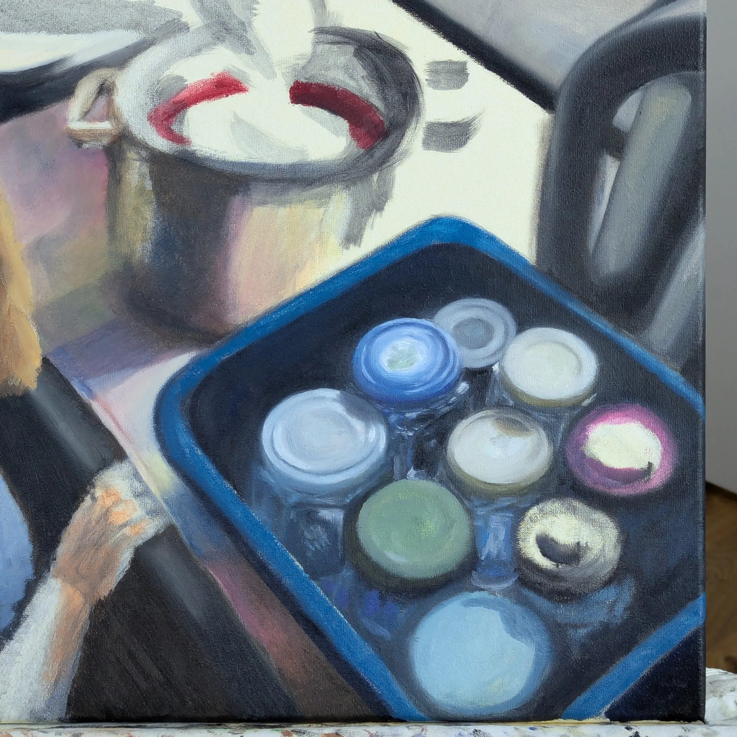
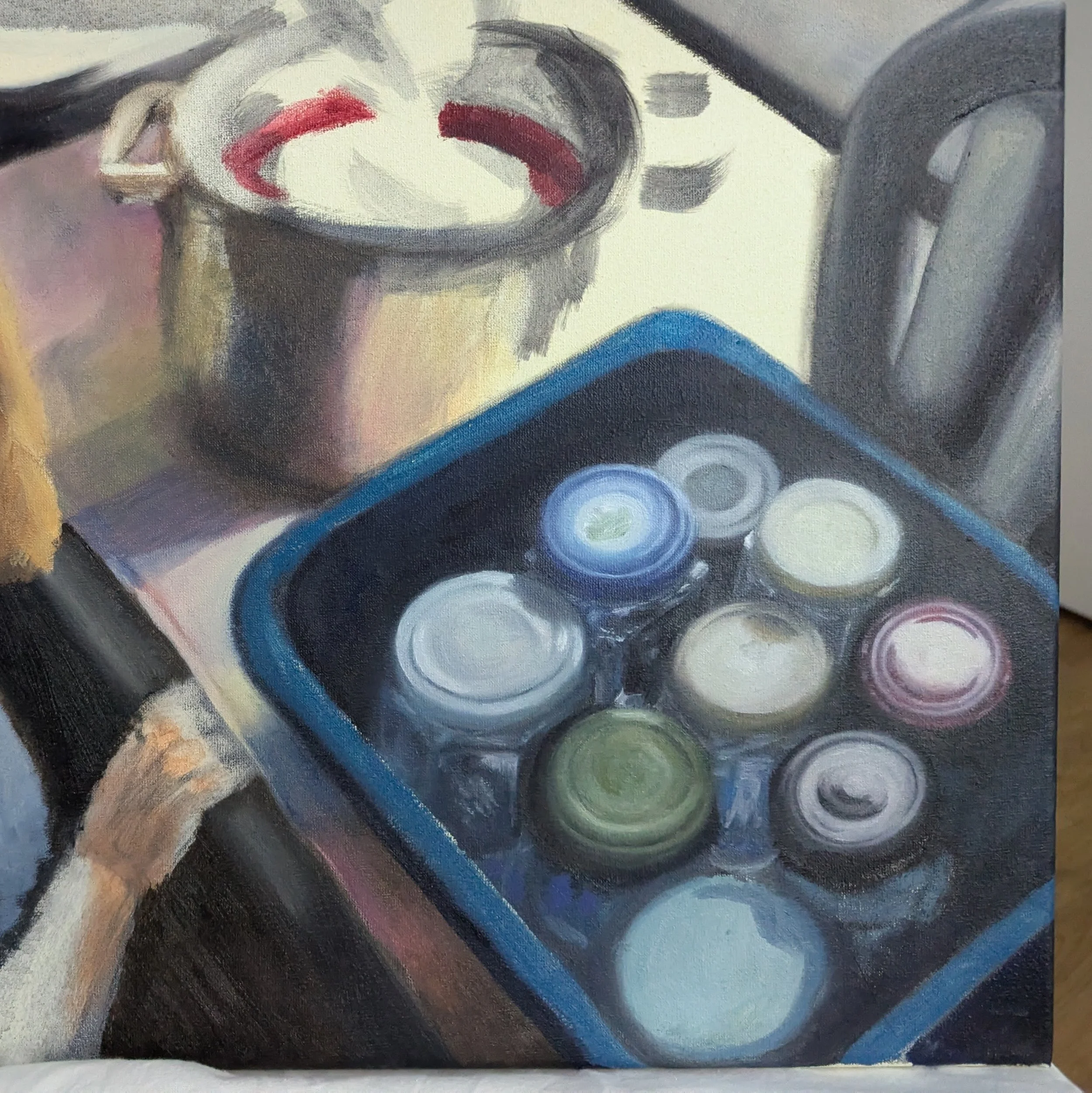
I did get impatient by the end, though, and was relieved to finally move on to the pot (another circle!) and hands. I kept them soft and desaturated because, like the cloth, I didn't want them to steal too much attention.
Using softness and sharpness strategically was a good point I'd picked up from Color & Light, very useful in this painting. Since the background has eye-catching elements like warm colors and light, I relied a lot on softness to keep them out of focus while the portrait and jars remain in focus in the foreground.
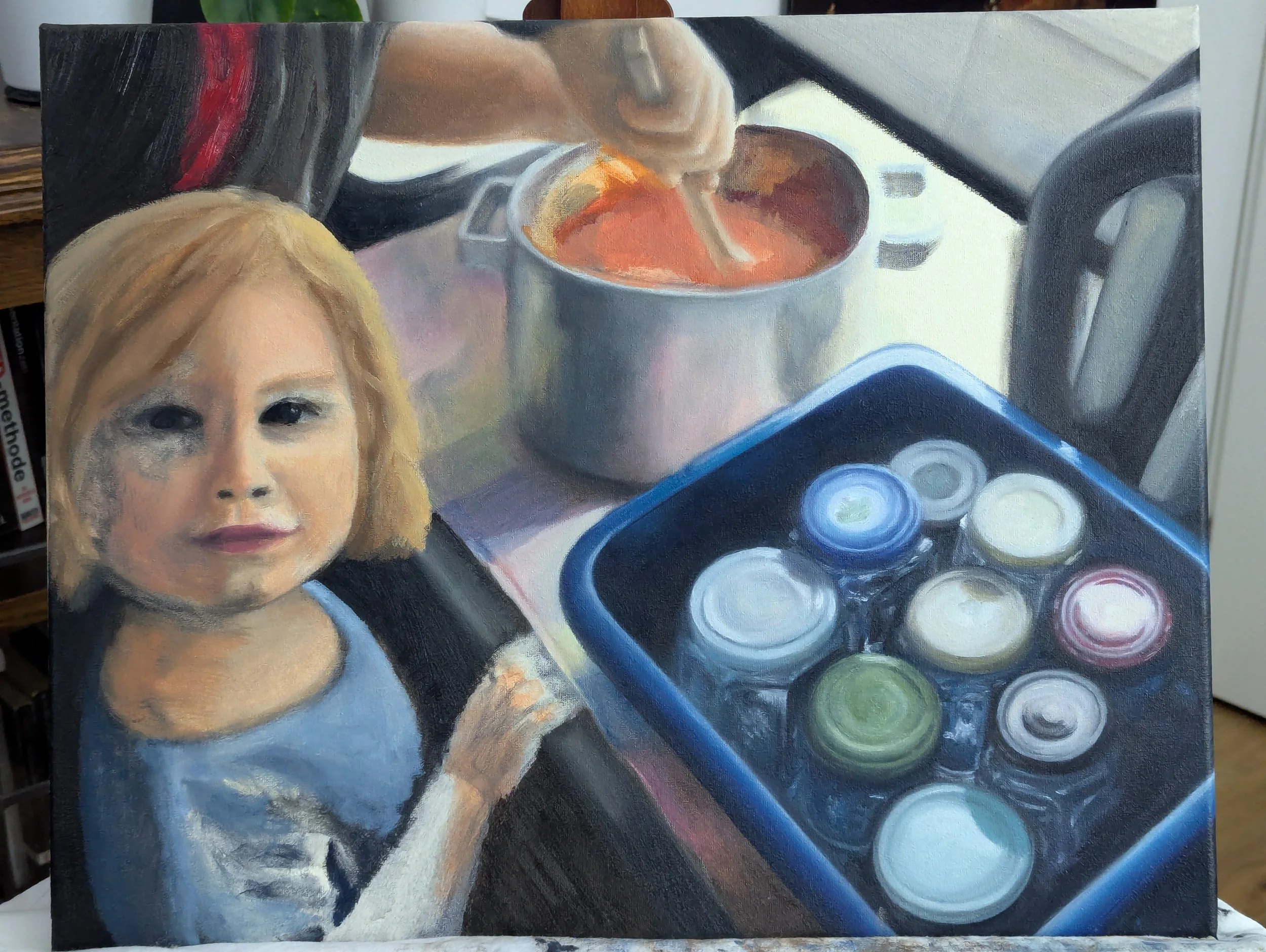
Finding a balance between softness and clarity was sometimes tricky, like when I painted the right-side handle of the pot. I wanted to capture the reflected sunlight on the handle without making it a central element of the painting, which took a while of adjusting the values and softness, making the reflected light fade into the cloth.
For me, the hardest part of painting with a reference - especially one I care about - is this process of interpretation, knowing which details to copy versus adjust in the painting. I love how paintings can capture an emotional experience, but it's challenging to know “where” the emotions are.
Mostly, I end up discovering what's important through trial and error. After spending an hour fiddling with that handle, I can confidently say it's emotionally important. I thought it'd be easy, but the feeling of soft sunlight hitting a metal pot while cooking is unique. I had to ignore the reference and rely on intuition to capture it, or try to.
I was planning to finish the pot during the next session, but the unfinished arm and dress were beginning to irritate me, so I started on them and left the strawberry jam for last.
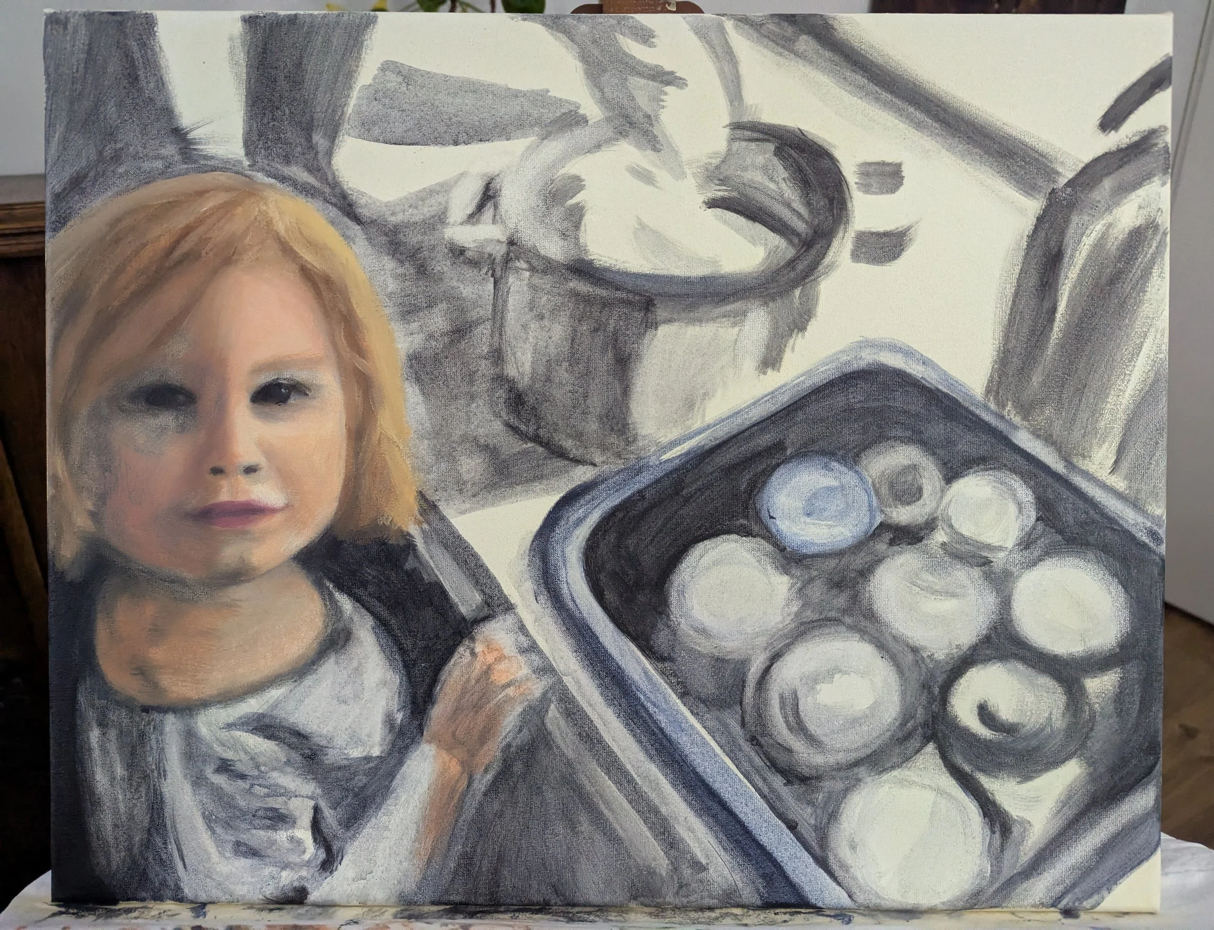
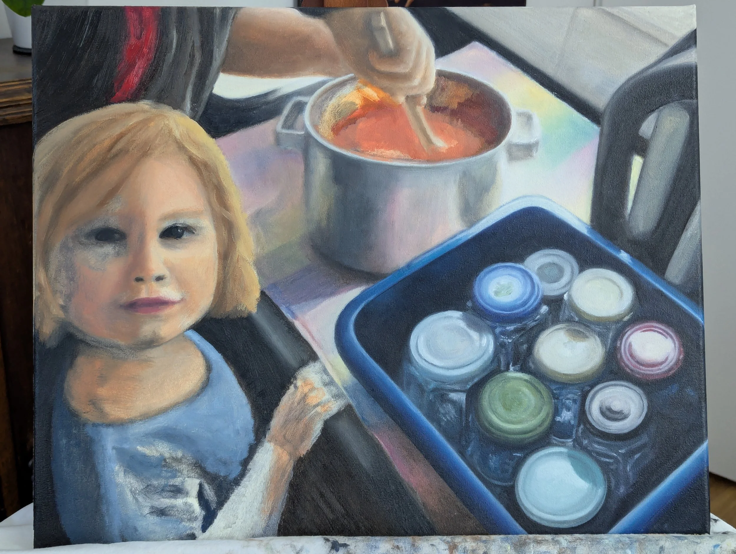
I thought about leaving the dress plain instead of striped to simplify the painting (read: out of laziness) but ultimately kept them because that dress was beloved by all. How could I take away its stripes, its whole charm?
Besides, the stripes were actually fun to paint once I got used to them. Out of everything in the painting, those stripes made me appreciate the slow drying of oil paint the most, since I could easily move and blend the paint to create the folds and shadows. That would've been harder or less enjoyable with acrylic paint.
However, I really struggled with the hand. I had to scrape off part of it and wait a few days to let the paint dry a little, giving me a fresh start. Fortunately the next session went better!
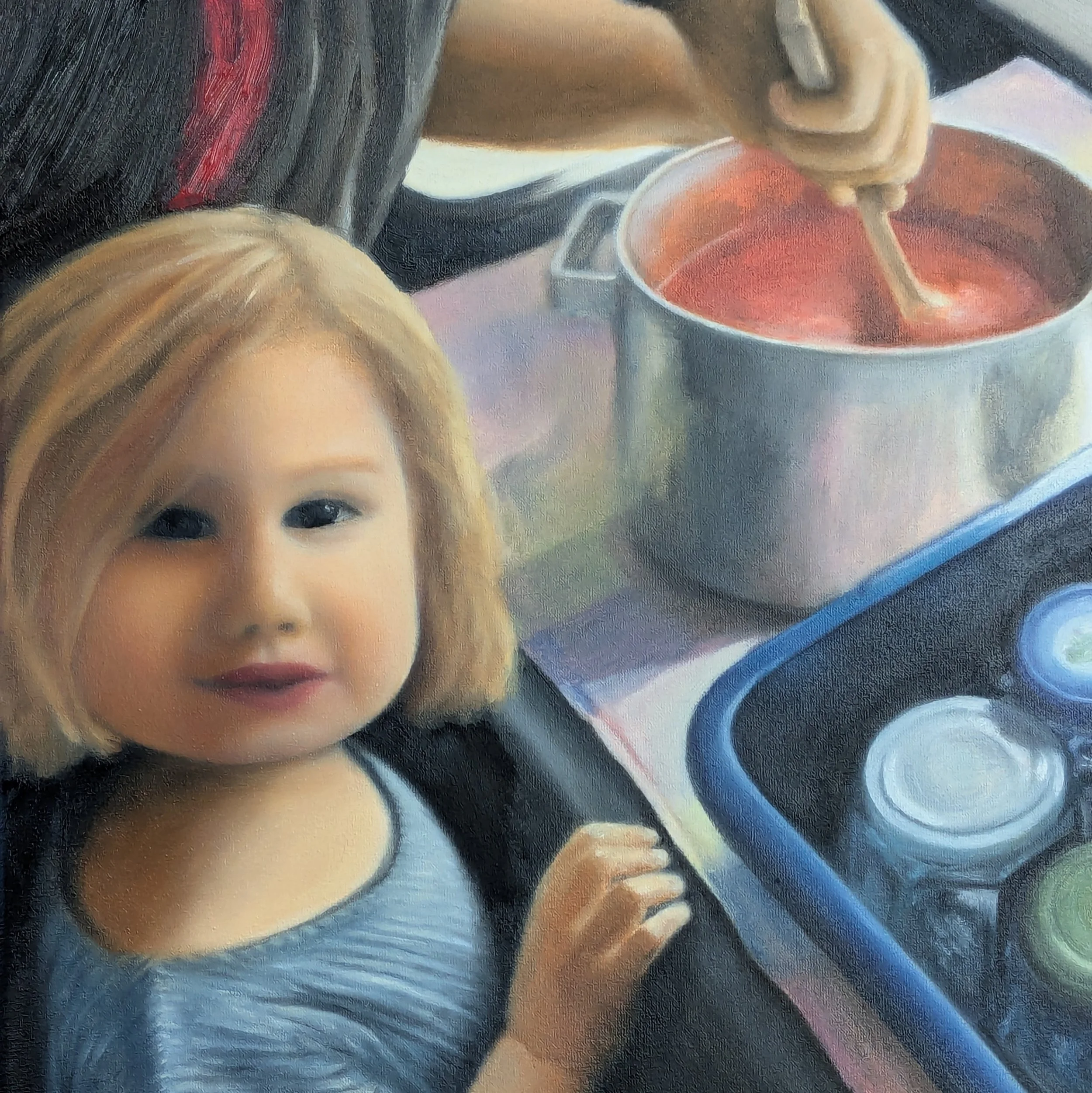
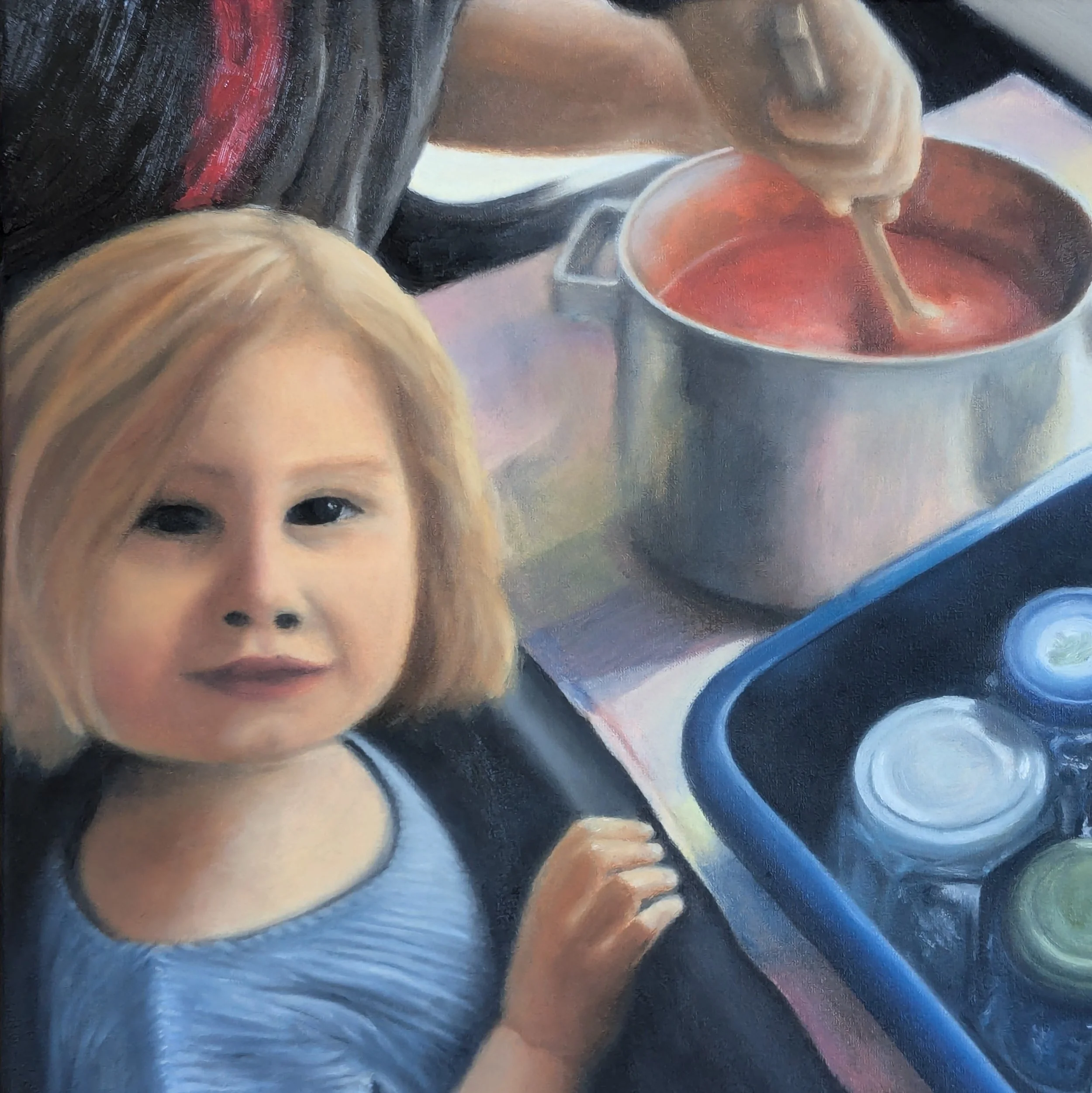
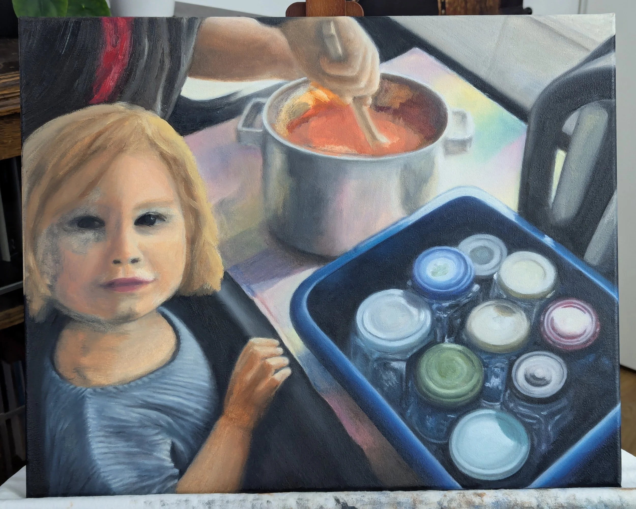
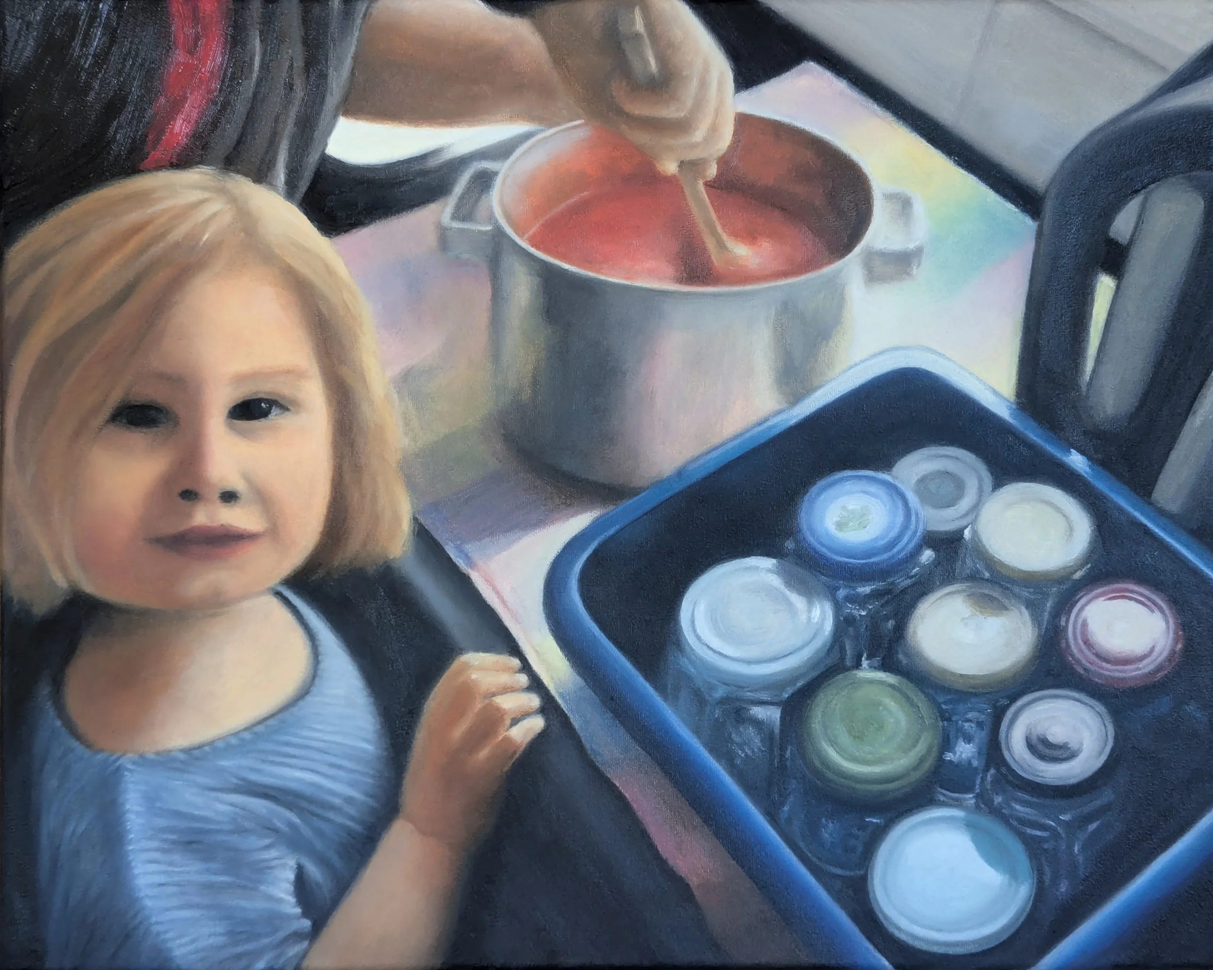
I was pleased with the hand, but getting the face right (especially the eyes!) drove me to the brink of despair. I spent a couple hours working on the eyes, over and over, since they're so important for capturing attention and emotion. If the eyes didn't match what I was imagining, I knew it wouldn't matter how everything else looked. The painting would still seem incomplete to me.
I felt like crying at one point because I couldn't get them right, but on the evening before my father-in-law's birthday, I finally finished the portrait. “The eyes are perfect! Don't touch them!” my daughter said, and I gave her a big hug.

All I had left was the jam, which I finished in a quick session the next morning. By that point, the painting already felt finished, and I was relieved and happy.
Although there are things I would do differently if I redid the painting, I'm still proud of how much progress I've made since doing my first portrait last year. Even if it gives me a migraine, maybe it's worth it.
Update:
In the six months since making this painting, I've grown more comfortable with oil paint, so I went back and adjusted some details in the portrait that had frustrated me in June. Here's the portrait now, showing how much I've learned!